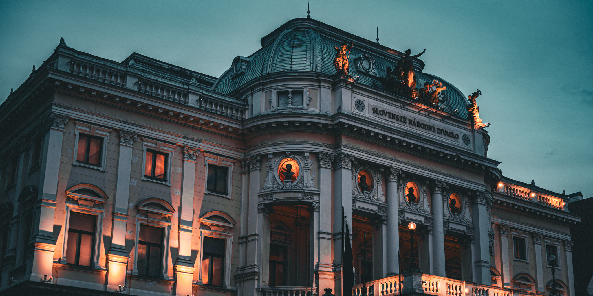
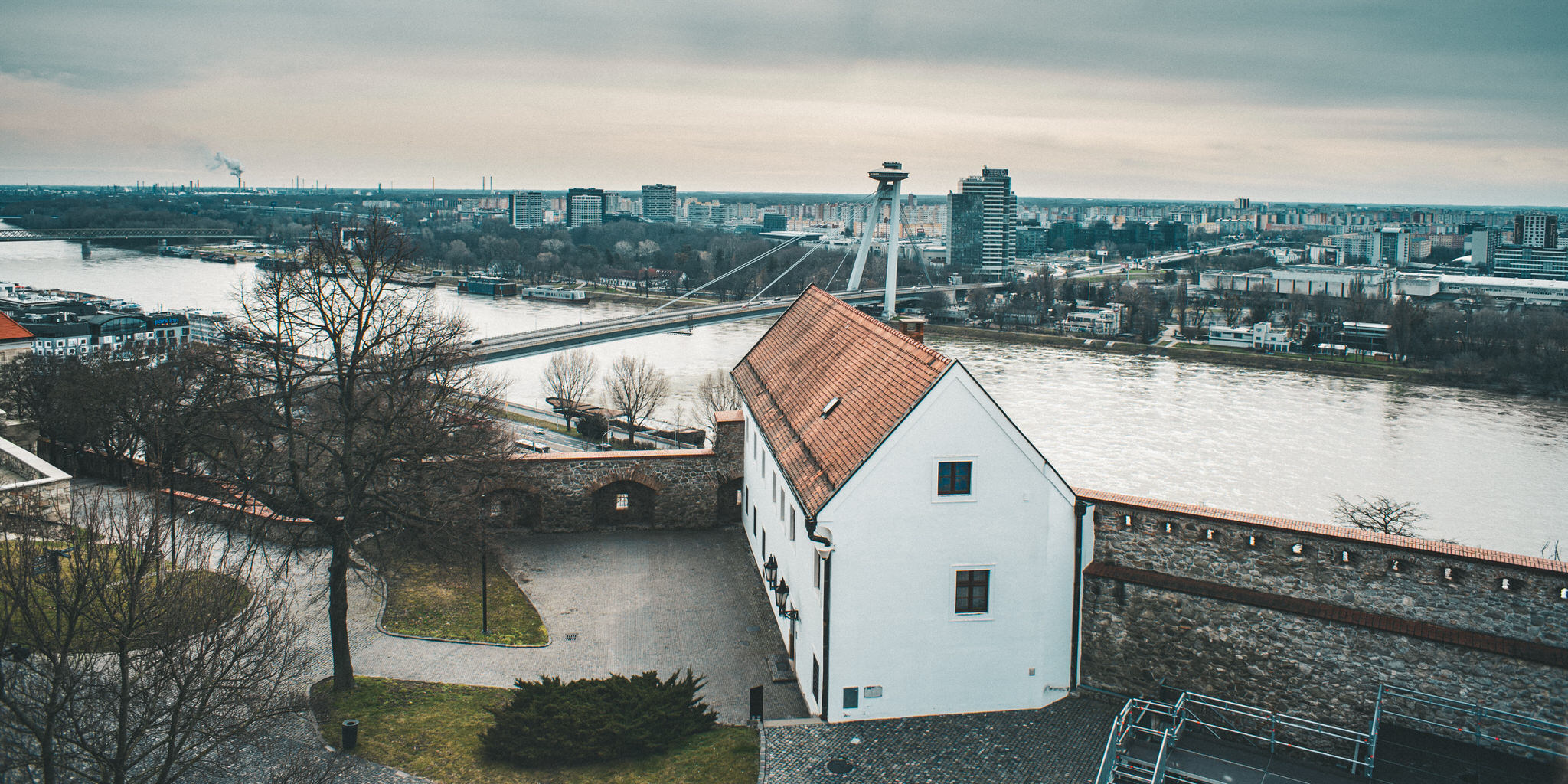
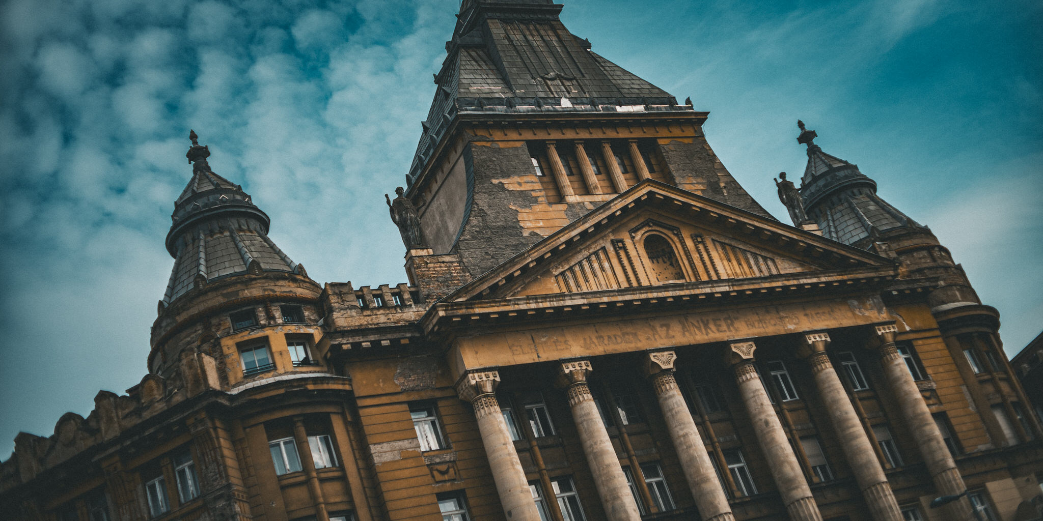
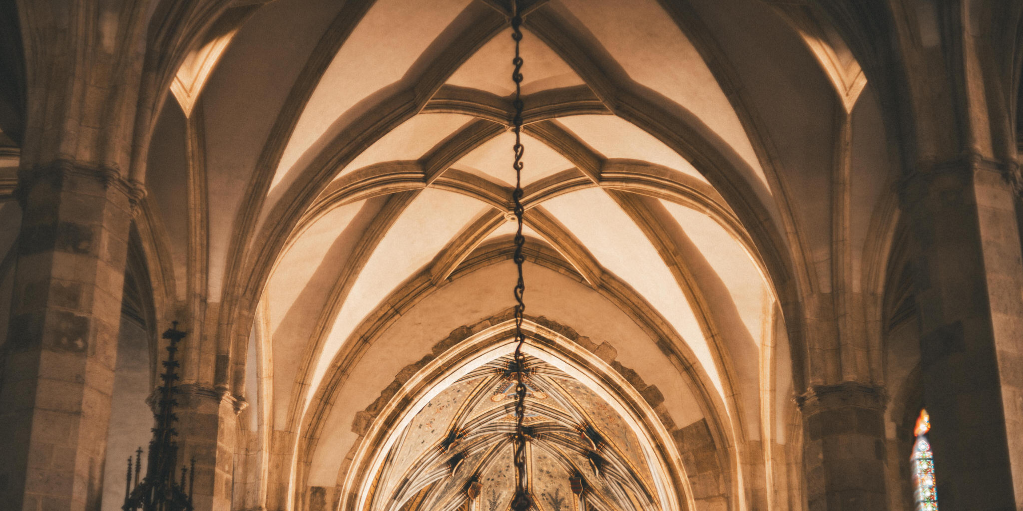
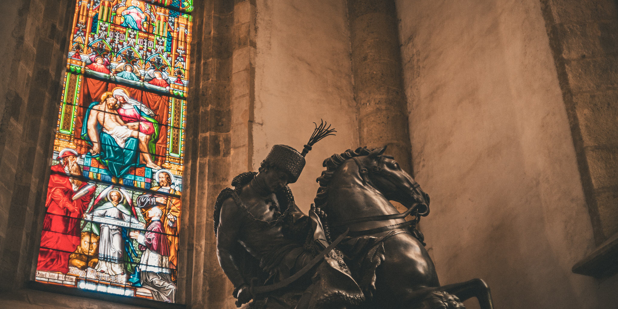
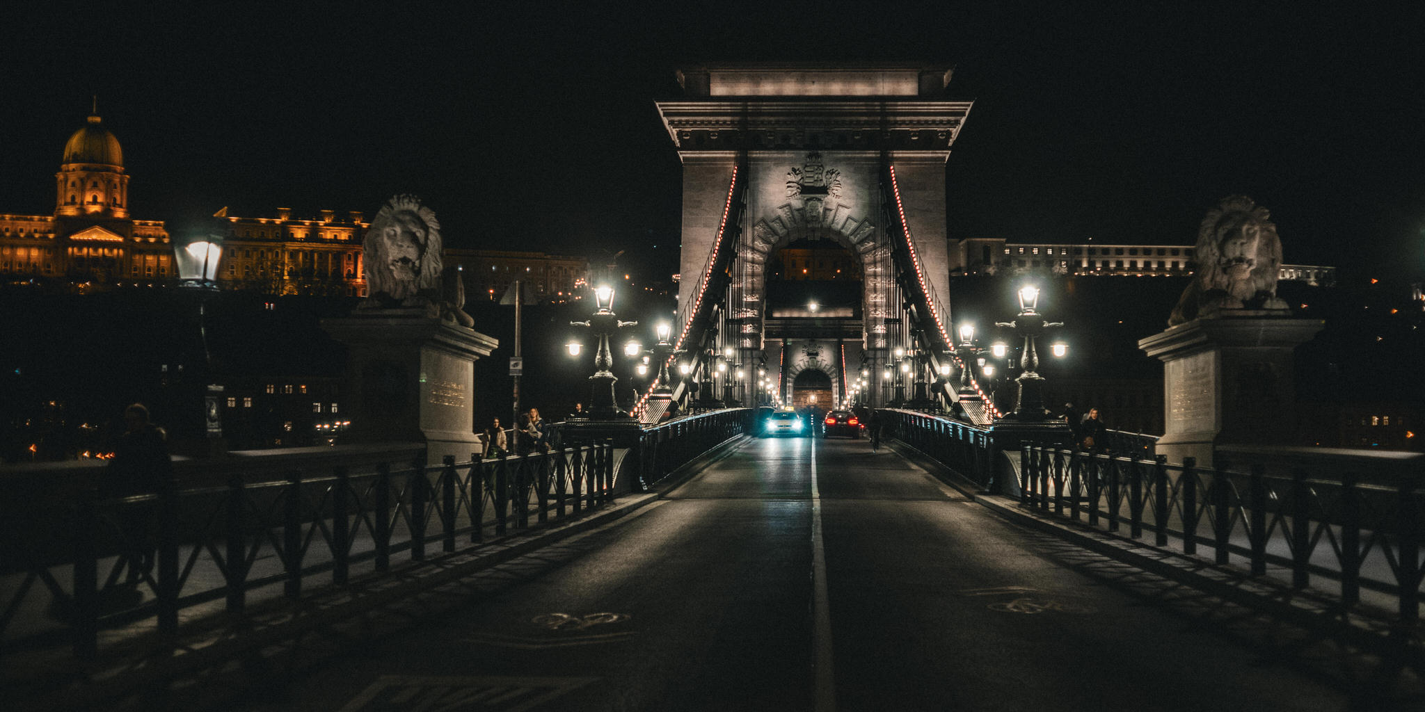
If you're traveling, you're taking a camera. And if you're taking a camera, then you're choosing a lens… or two, or three… to go with you. What do you do… do you pack every lens you own, just in case? Do you pack one or two zooms, to cover the basics? Do you pack a catch-all zoom, like the new Lumix 28-200mm f/4-7.1 lens? Super lightweight, incredible range, not the fastest lens especially at length, but it'll cover all the bases. Perfect travel lens, right? Or!… do you go old school? Pack something… vintage… something with its own character… something all manual? In cinematography, lens choice is a huge part of storytelling. Not just the focal length, but the actual lens characteristics. Anamorphic, or not? Clinically sharp, or soft and halo-ey? Specific bokeh shapes, focus falloff, chromatic aberration… all are characteristics that filmmakers consider. But for still photography, most of us probably don't think that way. We'll select a focal length, and a fast lens if we want shallow depth of field, but it probably ends there. Ask yourself – when preparing for your last holiday, did you consider – beyond focal length – what lens choice may or may not enhance your photos? I just got back from a week in Bratislava and Budapest. Two ancient European cities packed with amazing architecture. It's still winter there, which means it's a bit cold and overcast most of the time. So; flat light, minimal shadows. Also, early sunsets, and with any luck, some pretty ones. To me, this called for vintage lenses with lots of their own character. I have a set of Pentax Takumar lenses that I've built over the years, adapting from M42 screw mount to full frame L-Mount, plus, I've put a filter adapter ring on each lens to make them all 67mm, and added follow-focus gears to each one for filmmaking. I actually like the geared rings for manual focus too; it makes it easier to find the focus collar when looking through the lens. My favorite of these is the Super Takumar 50mm f/1.4, although I debated bringing just the 35mm and making that my only lens, but ultimately decided on the 50/1.4 and 24mm f/3.5. I brought a polarizer for shooting in the day, and very importantly, I brought a 1/4 Pro Mist for shooting at night. I really wanted that “cinematic” diffusion on any light sources in the shots. So… let's look at some edited photos, then we'll take a close look at some unique characteristics of the photos due to the lenses, and then we'll see how I edited them. Let's look at some of what I think makes these lenses so special. First I want to focus on defocusing; the focus falloff and almost blooming of focus you get here, especially on the 50mm and especially when shooting wide open. Let's see the photo with no adjustments; starting in the center it's quite sharp; not as sharp as a modern lens but certainly sharp enough. But look at what happens to the edges as they fall out of focus both because it's farther from the camera, but also due to a natural softness of the edges of the lens. You get this blooming; simultaneously soft and sharp image, almost like there's a blur layer added on top in photoshop with a transfer mode. But this is all in the lens! You see it in this photo too, as each statue become more and more bloomed. Check out her sickle; it has a huge bloom around it, and that's not from the pro mist filter – this was daytime, and I only shot with the Pro Mist at night. Finally in this photo, one of the few with what you'd consider shallow depth of field, look at how the out-of-focus areas show up. There's nearly a double image; I'll reset the photo and just lower the exposure; check that out. And this isn't motion blur; this photo was shot at 1/1600 of a second. You can also really see the chromatic aberration here, and we'll come back to this image again later to show how I handled that. So yeah, the focus falloff is really interesting in these lenses, and absolutely the primary thing I love about them. Another prominent characteristic, especially when shooting wide open, is vignetting. You probably noticed heavy vignetting on some of the shots; I may have added some to a few, but have a look at what the lens does on its own. Again I'll revert the photo to remove all adjustments. You can see the edges are a bit darker, but if I lower the exposure, that becomes much more obvious. Here's another example; same thing. These lenses tend to have a pretty heavy native vignette. Another, less desirable effect of these lenses is the chromatic aberration, especially in areas of high contrast. Fortunately, Lightroom's built-in Chromatic Aberration removal can work remarkably well. Watch this. This photo of the statues against the sky is actually really, really high contrast. If I revert this back to the original, and let's just zoom in a little bit more, you can see around the edges just how bad the chromatic aberration is. The blue in there, the orange in here, and so on. If I lower the exposure a bit, it becomes even more prominent. Let's drop that down, maybe add in a little bit of clarity, and you can see how that really starts to show up. To get rid of it though, check this out. All I have to do is click the “Remove Chromatic Aberration” button, and it's all gone. It really does work remarkably well. Now, it's not always that easy. Let's look at another photo. In this photo here, if I zoom in along the edges, you'll see this huge chromatic aberration that we looked at earlier that's surrounding the whole statue, and this is really big. So the chromatic aberration checkbox, which is already on, is really not gonna do much in here. So let me show you how to fix that. I'm gonna go over to the masking tools, and I'm gonna start by building a new mask based off of a color range, and I'll select right where that purple is. Just drag a little box to select that range in there. Now, right now it's selecting way too much of the image, so I'm gonna take the color range refinement, drag that down until I get just those purple edges in there. At this point, it's a bit harsh. Don't worry, we'll adjust it later, but it's also a good opportunity to look and see if it's got more than what you wanted. This actually did a pretty good job of just selecting the edges, but had it selected a lot more, now would be a time to brush some of that out. And a great way to do that is to go over here to the subtract mask tool, and then use something like a brush tool to then go in and negatively brush out part of the mask if needed. But it looks like I don't need to do that for now. Let's go back to the color range mask, zoom into that a little bit, and see how I'll affect it. The way I'm gonna fix this is primarily with desaturation. Because this image is largely monochromatic, I can get away with just pulling saturation out of this to get rid of a lot of that purple. That's done a great job on its own right there. Now it does look a little bit bright for whatever reason; it's kind of lightened up, so a little bit of an exposure drop should fix that. Drop that down just a touch, and we're definitely getting there. Now there is some hard edging that's showing up in here, and that's because I did take that color range refinement and take it all the way down to 1. So if I just expand that out a little bit, it should bloom out a little bit, soften the edges, and start to look a lot more natural. Now finally, you might get to some spots that do need some manual retouching like this one here. So let's just zoom into that, and just like I showed how you can remove from the mask, we can add to it as well. So I'll add with a brush, make sure the brush is the right size here, and simply brush over that area to get rid of that extra purple. When using older lenses like this, chromatic aberration can be a real problem, but usually it's easy to avoid – it really affected very few of my photos – and, it's usually really easy to fix. Now let's talk about the filters I used. As I said I had a polarizer on during the day and a 1/4 pro mist on at night. I don't have any with/without photos to compare, and with the mostly grey skies the polarizer probably didn't do much, but in general I like the richness in water and blue skies – when you can see them – that you get when using a CPL. The ProMist though is a bit more obvious. Here are a few of my favorite night photos where you can really see the filter in full effect. Combined with the already bloomy results of these lenses natively, I think this really punched it up a notch. Then of course there's the general treatment of the photos. Every photo edit started with a preset that I'd built before. Now that preset may have been an evolution of a built-in preset, or even one that I downloaded, or maybe I built it from scratch… I really have no idea. But however it began, I've certainly made it my own, and even on this trip I kept evolving and updating it. I've made two versions of this preset available for download for free on my website; there's a link in the description below, or if you're not watching this on your phone, you can use it to scan this QR code to get to the presets. So, let's take a couple of photos from RAW to final. I'll start with this photo here, and let me go ahead and bring this back to its original. And the first thing that I did to each image was crop it. I wanted this very cinematic look to it. So I actually shot everything with a 16:9 aspect ratio. So that's what I was looking at through the camera. But I did then further crop everything down to a 2:1 ratio. I just wanted that kind of extra wide cinema looking feel in here.Once the crop is set, we'll go ahead and add a preset. Up here under the presets, you'll see that I have my own installed, and these are some of the ones that you can download. And I believe that that's the one I started with there. So just that one hit, it's called Slovakia v1, and you can see that it's done pretty much everything that you saw earlier. If anything, it might be a little bit too dark. So let's close out the presets and make it just a little bit brighter. But overall, I really did want this dark, gritty look to the images. So there you go. That's probably all I did to that one. So I'm just gonna leave that one there. This one on the other hand is a lot more complicated. So let's get this one going. Once again, I'll go to my history here and go back to the original. That's how this one started. I'm not gonna bother cropping this one now. I just want to adjust it. Let's again, start with the preset and see if there's anything here that helps. And I think for this one, I probably worked with this one here, Slovakia v3. Obviously this is way too dark. I clearly exposed mostly for the window here, being sure not to clip any of the highlights and let the shadows fall down. But let's see what I can do by lifting up those shadows in here. We'll just take the exposure overall and bring that up. And as you can see, there is quite a lot of detail in there. Obviously though, I'm gonna have to do something about the windows. But let's start by just bringing that up. And I also want to bring this up a little bit warmer. So I'm gonna go to my color temperature and warm that up quite a bit in there. Great. Now for the window. This is a part of the image that could be a total nightmare to mask. Trying to get a really clean edge between the bright glass and the dark wall could be problematic. But Lightroom's got these AI tools that are kind of remarkable. Watch this. I'll go to the masks, create a new mask based off of Object. And then I'm just going to draw a box around the window, just like… that. And… and… and it did it. It selected the window. If I now go over to my exposure and drop that down. Ha ha ha, look at that. That is pretty incredible. Okay, that's great. How about the horse and the rider? Still a little bit too dark. I wanna add a little bit of brightness in here and really just bring up the highlights to make sure it's got some more contrast to it. So once again, I'm going to use the AI tools in here. I'm going to create mask. And this time we'll try just the subject and see if Lightroom can separate the horse from the background. Now it has, it's done a great job, but it also grabbed the window again and also missed this gap under the leg. So to fix that, we're going to go to the mask remove tool. I will remove with a brush and let's just get rid of the entire window here. Just paint that out real quick. Now we need to get rid of that hole there under his leg. So once again, I'll go to subtract. This time I'm going to use Object again. And then I'm just going to draw a box around that area and let's see what it does. Looks pretty good. Looks like it kind-of got that hoof in there. So let's just add that in with a brush and I'm not going to get too particular about it right now, but you get the idea of what you can do. Let's go ahead and zoom back out and affect the image. Now again, I said it's a bit too dark. I don't want to just brighten it up like this because that's going to look very unnatural. I might be able to get away with a little bit of brightening, but really what I think I want to do is take the highlights and bring those up to make them stand out a bit more, almost as if there's an extra light shining on the horse, which of course there was coming from the window over here. Of course I could do more to the image, but I think this is off to a pretty good start and gives you an idea of how I went about editing these. Let's look at one more. This is another one that takes advantage of the AI masking tools. I'm going to once again, start by reverting this back to its original state in here. And then I'll go ahead and crop it. Let's bring in the 2:1 crop. As I push this up on here, we'll see we still have the power line in there, which is just distracting. So I'm going to go ahead and get rid of that with a quick retouch tool. Using the healing brush, we'll just wipe that thing out and off it goes. Now, if you look at this building, you'll see that the light was quite clearly hitting right about here, pretty much center, kind-of coming from the right. And unfortunately this side of the building is largely in shadow. And this is what I'd probably consider to be the front. And if you look closely, you'll see these statues in here. So which really does mean it's quite an interesting part of the image. So let's go ahead and get our preset on there to start. I think that one is going to do the job here. And let's go ahead and use a masking tool. I'll let it auto select the subject. It's done a pretty good job there once again of grabbing the building. And what I really want is just this side of the building, the front of the building, not the other side here. So once again, I'm going to use the subtract mask tool and this time use a linear gradient. Just to go from probably about here to here. So now this side of the building is not being affected at all. This side is and the fall-off is from this edge to the center, which I think will work out quite well. Now I'll go ahead and take the exposure on there, bring it up a little bit, probably right about there. So you start to get an idea of the type of editing that I was doing. Each one of these images was edited quite quickly. I did it all on my iPad and I edited every night in the hotel room. And each one of these started with a preset and then had a little bit of extra love added to it. I love these photos and the way they came out. I wanted a gritty cinematic look to the images that played into the aesthetic of the architecture. You wouldn't treat photos of a trip to Disneyland this way or photos of ultra modern Shanghai or the jungles of Brazil, but this fits old world Europe and I love it. What's your favorite travel lens? Would you shoot a trip with vintage glass like this, manual focus? Let me know in the comments what lens you think is the best for traveling. If you haven't subscribed to the channel, be sure to do that while you're commenting. And I'll see you in the next video.





Comments from YouTube