Creative Filters and Effects with Tiffen Dfx v4 (part 2 of 2)
[Part one of this post looked at Organization and Philosophy as well as Filters and Presets in Tiffen Dfx 4. If you missed it, you should read that first then come back here.]
Masks
Dfx 4 also has some fairly sophisticated masking capabilities, which you can apply to each of the layers. Once created, masks can be reversed or copied between layers and combined with other masks in the same layer. This enables you to create quite complex masks for selectively applying filters to portions of your image.
The problem of course with masks in general is creating them accurately, and for this Dfx has an EZMask function, which allows you to draw rough mask areas and then the program intelligently guesses where to place the edges of the mask. It’s not quite as easy as creating a mask in the OnOne suite but is certainly a step up from many other programs.
Compare
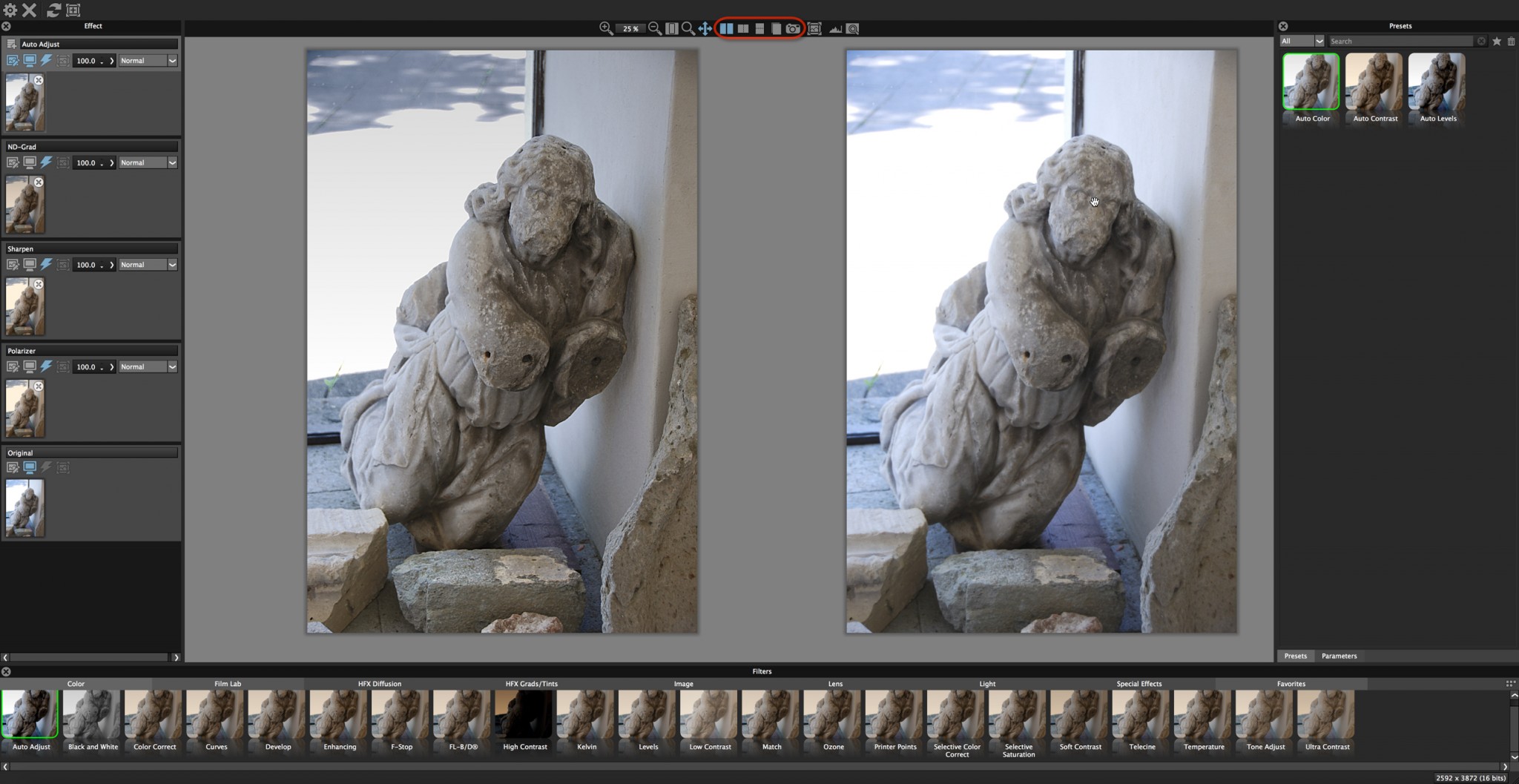
At the top of the Viewer pane there are a set of tools to change the size of the image and to do various compares. The range of compare options is extensive and works in conjunction with the left Effect pane where you can select which layers you want to be included in the compare process.
In fact, this is the most sophisticated compare function I’ve ever seen. Here is what you can do:
- Choose between a vertical and horizontal slider and wipe across the image
- Stack the layers to see the effect of each individual layer side by side
- Do an a/b comparison
- For each of the above choose which layers are included in the comparison
- Take a snapshot to lock in memory your changes and then compare later changes with the snapshot
An after/before compare below where this rather anaemic looking picture of a statue on the island of Bled has been lifted with various filters. Here I loaded the image into Dfx directly from Aperture.
 A tiled after/before view - one of many ways to compare effects
Usage and Tutorials
I tested Dfx 4 in each of Aperture, Lightroom, Photoshop and Capture One and it worked fine from each, though I had to choose the file to save to for Capture One. It’s not a RAW convertor though, so don’t expect to directly import a RAW file and get a great image to start with—you'll need to work from a TIFF or JPG file. I did experience one crash whilst I was evaluating the software though I wasn’t doing anything special, and I did much the same afterwards with no repeat of the problem.
Tiffen have a range of short and very helpful tutorials for Dfx on their website. They are based on the prior version 3, though I didn’t find this an issue in terms of coming to grips with the software.
All in all I was impressed with Tiffen’s Dfx 4. It is easy to use, has a vast range of filters that can be easily combined, tweaked and masked in almost any way possible onto images; you just choose what you want to do based on visual presets. Its compare function is second to none, it has a sophisticated masking function, and of course for me a real bonus, as a recent switcher, is that I can use it from Capture One. Of all the filters I tried, the new Pearlescent one, at the subtle end of its intensity range, was my favourite—but there are plenty of others to choose from.
Have you used Tiffen Dfx 4 yourself? If so, please offer your thoughts below in the comments!
More like this
- Tip
- Store
- Store
- Tip
- Tip
