Improving Images with Easy Contrast Adjustments in Aperture 3
EDITOR'S NOTE: This is a great post on understanding the importance of contrast, and includes an introduction to the histogram. After reading this, also check out Live Training 108, where I went into the histogram in a bit more detail.
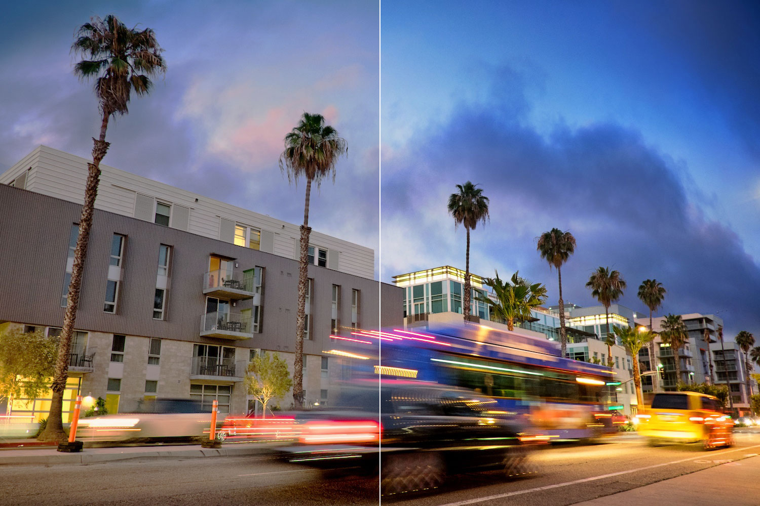
 One image with two levels of contrast. Which side is more compelling?
When I first got started in photography, I always wondered why my photos never looked as vibrant, rich, and three-dimensional as those in magazines. I spent a long time trying to figure out the answer to this question, and I am framing today's tip around one of the first lessons that I learned about post-processing: optimizing contrast is one of the easiest ways to quickly improve an image. Luckily, boosting contrast is one of the most straightforward things to do in any post-processing software suite, and Aperture 3 has several great options for making this happen.
What is contrast? Why does it matter?
Contrast is a measure of the difference between the deepest shadows and the brightest highlights. If a photo has deep, inky blacks, and bright, blinding highlights, then it has high contrast. Achieving the right contrast makes shadows darker, highlights brighter, and it is often the first step to getting those magazine-quality images.
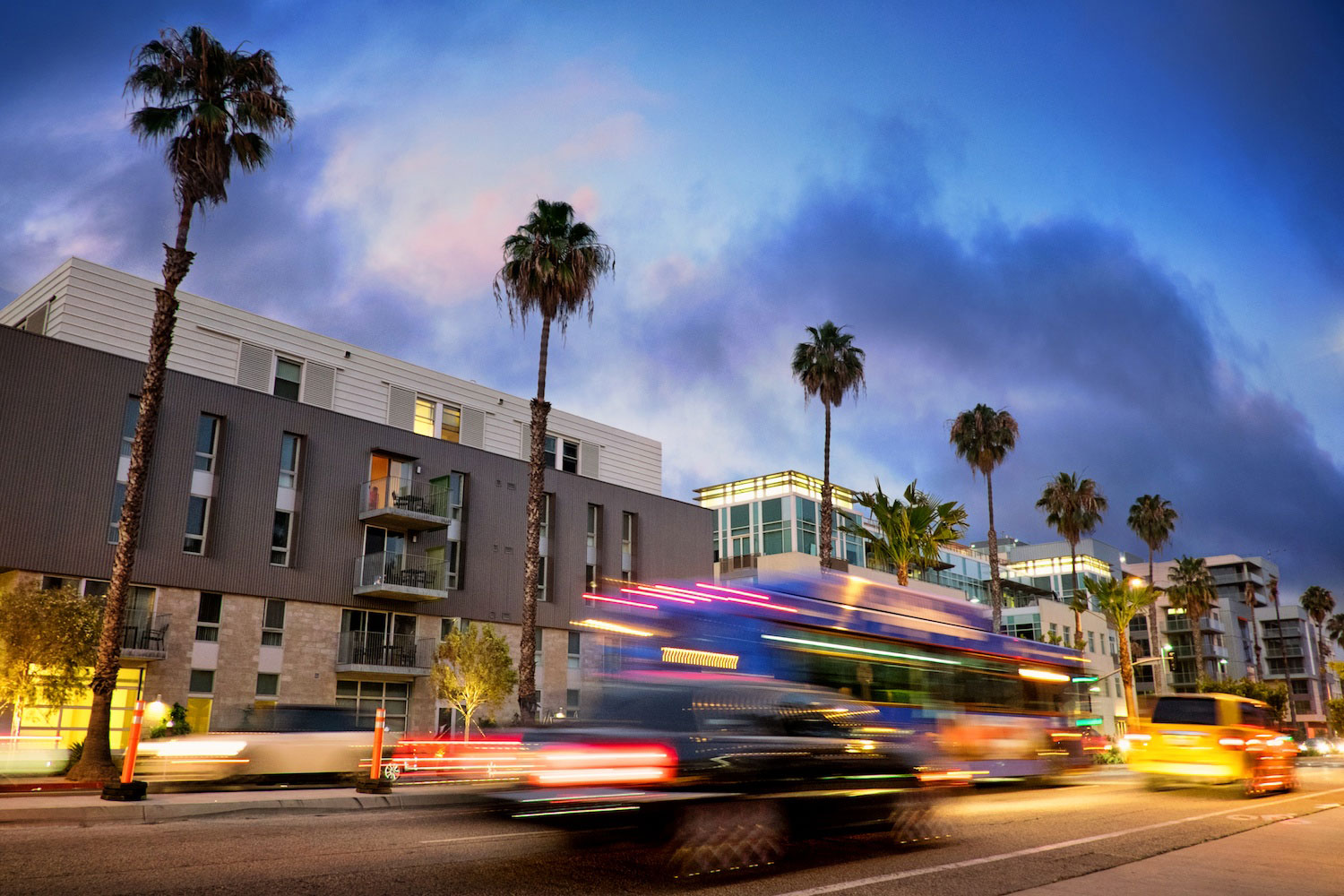
Moving past the technical definition, optimizing contrast is also a great way to help guide the viewer through your image. In the full contrast version of the title image (shown below), I use high contrast to emphasize the colors of the moving traffic because this is where I want the viewer to look first. After that, I want to guide their eyes up toward the clouds, and I encourage this progression by increasing the highlights in the upper left quadrant.
 A high contrast version of the title image
Contrast and the histogram
Before we begin making actual adjustments, you can get an intuitive sense for the difference between high and low contrast by choosing a sample image in your Aperture library, grabbing the Contrast slider, and jogging it left and right. As you do this, notice how a low contrast image (Contrast slider has a negative value) looks muted because the shadows tend to be dull and grey. On the other side of the spectrum, ultra high contrast images lose their shadow detail and have blown-out highlights.
As long as we're playing with the Contrast slider, it's useful to make some observations about what a low-contrast image looks like in the histogram. Grab the Contrast slider and move it all the way to the left so its value is -0.5. Now take a look at the histogram: it should look like an isolated plateau in the middle of the histogram window. When you see a histogram that looks like this, it means you're potentially leaving some contrast on the table: the brights could be brighter and the darks could be darker.
Ironically, I find that Aperture's Contrast slider isn't very useful for increasing contrast because it's often too heavy-handed. (Moving it a short distance makes too drastic a change in contrast.) So, let's set the Contrast back to it's default value of 0 and explore some other ways to adjust contrast.
When JPG or RAW images come straight out of a digital camera, they tend to need a boost in contrast rather than a decrease in it. For that reason, for the remainder of this post, I'm going to assume that our goal is to boost contrast (rather than decrease it).
Three options for automatic contrast adjustment
For this article, I am going to focus on the easiest ways to boost contrast in Aperture 3: by asking the program to optimize it automatically. There are three ways to do this:
Auto Enhance. Auto Enhance is Aperture's one-button solution for applying a single, automatic image-improvement adjustment, and optimizing contrast is one of the goals the algorithm tries to achieve. Auto Enhance can be useful for two reasons. First, if you're a novice at post-processing, Auto Enhance offers an easy way to quickly improve an image. (Incidentally, this is a great way to start learning how Aperture's sliders work. After using Auto Enhance, you play with the resulting adjustments to get an interactive sense for what each adjustment does to the image.) For the more intermediate user, Auto Enhance can serve as a useful starting point for additional, more refined adjustments. While it is very convenient, Auto Enhance does a lot more than just try to optimize contrast, so it's likely not the best choice if contrast is the only adjustment you're trying to make.
 The auto-enhance button tries to optimize contrast (among other things)
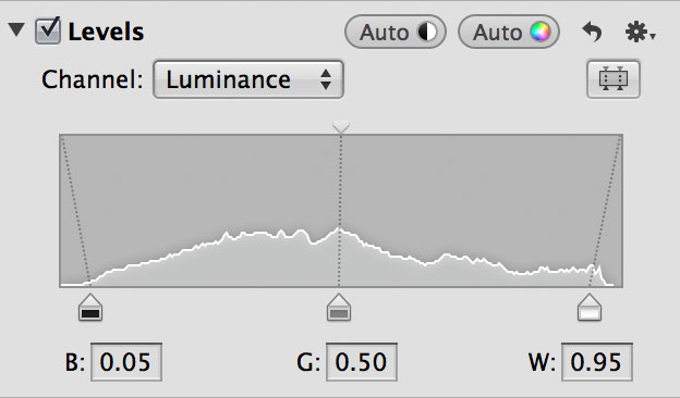
Auto Levels. A automatic auto approach is to use one of the two Auto buttons in the Levels adjustment palette. The Auto button with the black/white half moon icon adjusts the levels according to the total luminance of the image (red + green + blue channels), while the Auto button with the color icon adjusts the image by optimizing the red, green, and blue channels of the image separately. Because both buttons are automatic and quick to implement (and undo), there's no harm in trying both to see which gives a more pleasing result. Personally, I find that the luminance Auto Levels button (i.e.: the half moon) is more reliable for making quick contrast adjustments. Why? Because hitting the color Auto button can also skew the white balance a little, in addition to adjusting the contrast.
 The Levels palette has two options for auto contrast adjustments
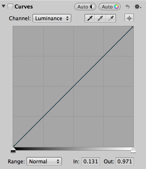
Auto Curves. The third automatic approach is via the two Auto buttons in the Curves adjustment palette. The two buttons work using the same approach as in the Levels palette: the black/white button adjusts according to the total luminance and the color Auto button makes adjustments by optimizing the red, green, and blue channels separately.
 The Curves palette also has two buttons for auto contrast.
Because of the nature of Curves, the image may lose a little color vibrancy as a result of using the Auto Curves feature, so you may have to add some back in by using the Vibrancy slider. (EDITORS NOTE: Under the gear menu, you can switch from Luminance to RGB modes in Curves, which will often add that lost saturation back in—however in some images, it will oversaturate! For more on using Curves, check out Live Training 011).
What's the difference between using Auto Levels and Auto Curves?
In short: finesse.
At the beginning of this post, I mentioned that optimal contrast is all about inky shadows and bright highlights. To achieve this goal in practice, it means we need to stretch the histogram so it covers the full extent (left to right) of the histogram window.
Auto Levels accomplishes this goal by making a decision on what the darkest and brightest tones in the image should be, and then it stretches the histogram out to fill the full extent of the histogram window. You can witness this for yourself by conducting the following experiment: Begin with an unaltered image. (This experiment will work better with a RAW image, but a JPG is fine, too.) Next, set the Contrast slider to -0.5. Notice that the histogram shrinks to the middle of the window, indicating a low-contrast image. Now, hit the black/white Auto Levels button: your image should look nearly the same as when you started. The reason for this is that Auto Levels took the narrow histogram (low contrast), found the left and right extents of the histogram, and stretched them to fill the extent of the scale. (While it may not be immediately apparent, this little experiment was not without detriment: In doing this, we effectively shrunk the dynamic range of the image. If you push Z to zoom in at 100% scale, you may see some posterization in the highlights or shadows.)
Auto Curves is similar to Auto Levels in that it still makes the same decisions about the darkest and brightest tones, but it also performs some adjustments on all of the in-between tones, as well. This is accomplished via a curve in the Curves palette that resembles the letter S. All of this means that Auto Curves has more levers available at its disposal for making adjustments (black point + white point + all of the points in between) as compared to Auto Levels (black point + white point). This suggests that Auto Curves should (theoretically) result in a more finessed final image. However, because Auto Curves has so many degrees of freedom, the result can sometimes look heavy-handed.
In practice, if I was limited to just these two methods, I would start by using Auto Curves, and if the result was overkill, I would fall back to the (usually) more conservative Auto Levels. If you need something to work the first time, every time, then luminance Auto Levels is your best option.
Suggested workflow and “customizing” Auto Levels
 In this example, the exposure and color have been set, but the shadows are a little dull. Time for contrast!
Let's finish with a suggestion for how you can incorporate auto contrast adjustments into your own workflow, using the above image as an example. For this image, as is typical when I'm processing images, I've already adjusted the exposure and white balance. I've also already made some color-related adjustments using Aperture's built-in adjustments along with a third party plug-in.
After these steps are complete, it's time to optimize the contrast. The reason we're doing it now (rather than earlier in the workflow) is because adjusting the contrast sets the shadows and highlights, and I want to make sure that I have the exposure and color control work completed before fixing the shadows and highlights in place. So, at this point, the exposure and color in this image are looking good, but the shadows are washed out and there's not enough pop in the highlights. For example, the mid-shadows in the tower are dull and the cloudless part of the sky could be a little brighter.
If I'm going to fix contrast automatically, I usually start with luminance Auto Levels, so let's start there with this image. This adjustment makes a good start at fixing the contrast, but I think we can do a little better yet. To finish, I'm going to tweak Aperture's Auto Levels adjustments by performing the following two steps. Note that these rules will work with any image that you're working with, not just this example:
- To make the shadows slightly darker, I'll grab the left (black) control point and drag it slightly to the right.
- To make the highlights slightly brighter, I'll grab the right (white) control point and drag it slightly to the left.
 If luminance Auto Levels doesn’t provide enough contrast for your tastes, move the circled control points in the directions shown to further increase contrast. The final positions of the control points is shown on the right.
When I'm done with this, I get the result below:
 The same image, after adjusting the contrast using the Levels palette. Notice how adding contrast really helps give it a three-dimensional look.
Making these final tweaks accomplishes two things: First, darkening the shadows gives the foliage and the buildings a more three-dimensional appearance. Second, brightening the highlights makes the cloudless portion of the sky brighter, and this makes it even more convincing that the sun is back there, waiting to poke out. Finally, just as it did with the title image, increasing the highlights in the upper left quadrant helps draw the eye up to the colors of the sunset.
Conclusion
As we've seen, adding contrast gives images more depth and interest, but proper use of contrast can also help focus the viewer's attention. For example, in the image above, I want the viewer to pay attention to the top half of the image, alternating between the colors of the sunset and the color contrast between the building's yellow lights and blue sky. By making the contrast adjustments that I did, I was able to increase the shadows in the lower third of the image, and this helps push the viewer's attention to the sky and the building.
More like this
- Tip
- Tip
- Tip
- Tip
- Tip

Comments
on June 13, 2014 - 5:23am
Thanks Dave! A good reminder that using auto controls are a good way to start and tweak from there or even be all you need without further tweaking. Also reviewing the basics always helps to solidify once again the purposes of different adjustments.
Steve Hadeen