Pixelmator for iPhone: An Image Editing Hat-trick
Pixelmator has arrived to iOS in full force. The recently announced Universal version (both iPad and iPhone) joins the tried-and-true OS X application as well as the more recently released iPad app, which has already received a glowing review from Joseph.
Put simply, Pixelmator for iPhone is equally praiseworthy. If you have been waiting for a killer iPhone photo editor with desktop-class tools, read no further. This app is a steal for $4.99 [affiliate link]—you won’t regret it.
Background
Pixelmator for iPhone markets itself as an on-the-go app for photographers, digital painters, and graphics artists, and as such provides an array of tools for these various use cases.
Before delving into my review, I should give some background. First, my main use for this app is photo editing, as I imagine is the case with many readers of this site. My day job involves some technical project support on websites, so from time-to-time I use the more graphic-art oriented tools on my laptop’s image editing software, but I doubt I will be a heavy user of these tools on Pixelmator for iPhone.
Although I may dabble in that functionality, you’re better off getting those perspectives from a fully-fledged web designer and/or digital painter (which I am not). As such, my review won’t cover the core features that cater to those audiences. If you are interested the full suite of tools offered, including any photo tools I explicitly mention, the company has produced this handy page outlining all supported features. Finally, all testing was done on an iPhone 6, and I did not have prior experience with the iPad app. With that said, off we go.
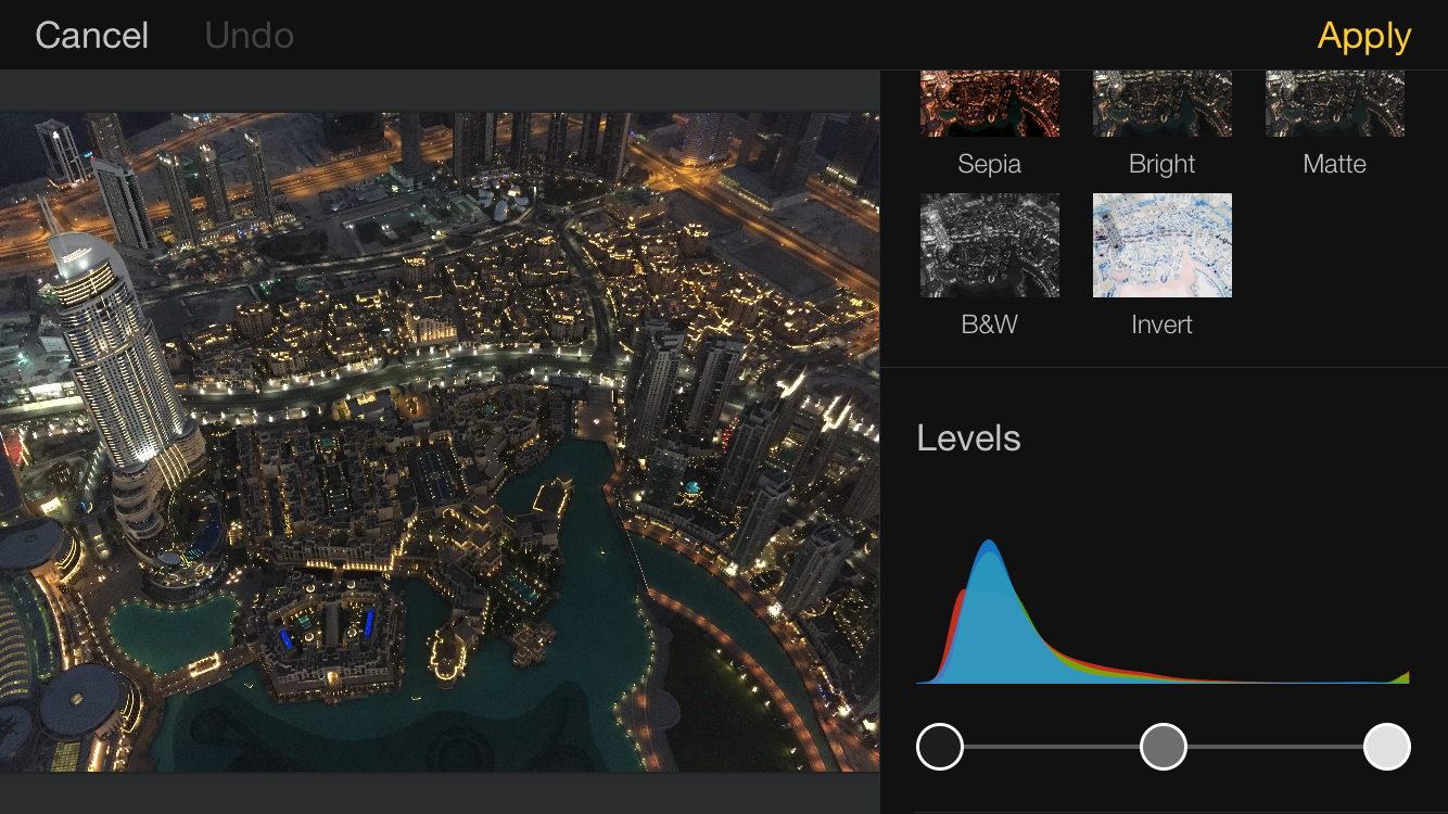 Pixelmator’s user-interface layout is easy and intuitive, with levels, curves, quick filters, and other options
First impressions
When initially launching the app, I went in with a clean slate. I did not read any tutorials or other reviews, and just dove in and started editing to see what was self-explanatory. I imagine most users will approach Pixelmator this way. In contrast to a desktop application, I don’t envision many users “reading up” on the app and its interface before purchasing, but instead downloading it from the App Store and setting off on their own.
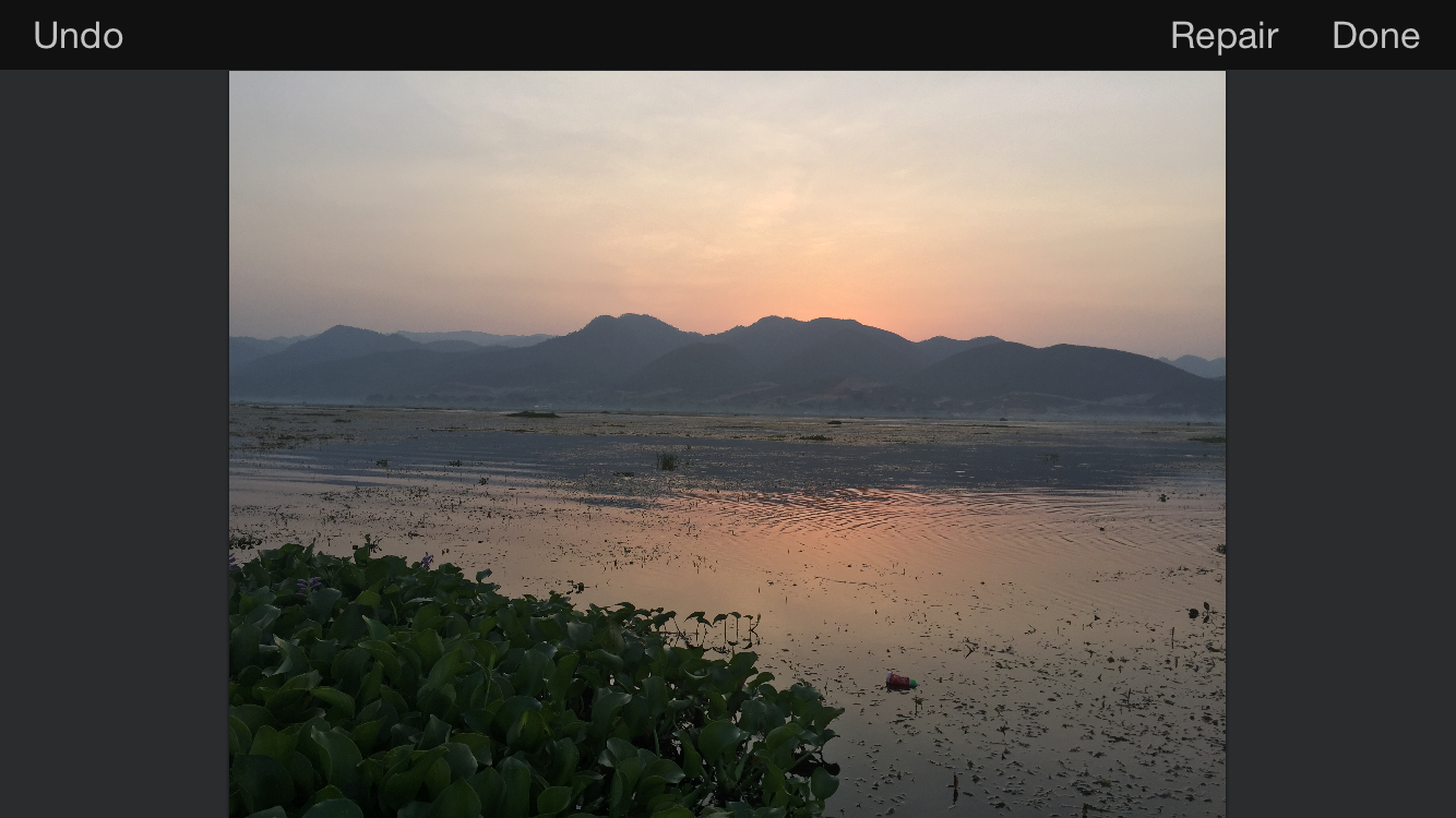 Before: Unedited sample image before applying the intelligent repair brush effect.
Thankfully, it turns out that you largely don’t need any tutorials or explanations to use the vast majority of Pixelmator's functionality… and functionality is something it brings in spades. The developer claims all of the tools of the iPad app are there, with some newer features added in: a suite of standard editing tools (levels, curves, saturation, contrast, color balance, etc.), intelligent retouching brush, sharpening, red-eye repair, a set of distortion tools, a slew of various filters… and that is just a small sample. The list goes on, and I have excluded tools dedicated for digital painters or graphic artists, of which there are plenty (including a full suite of layer-based editing tools, various brushes, text overlay, etc.).
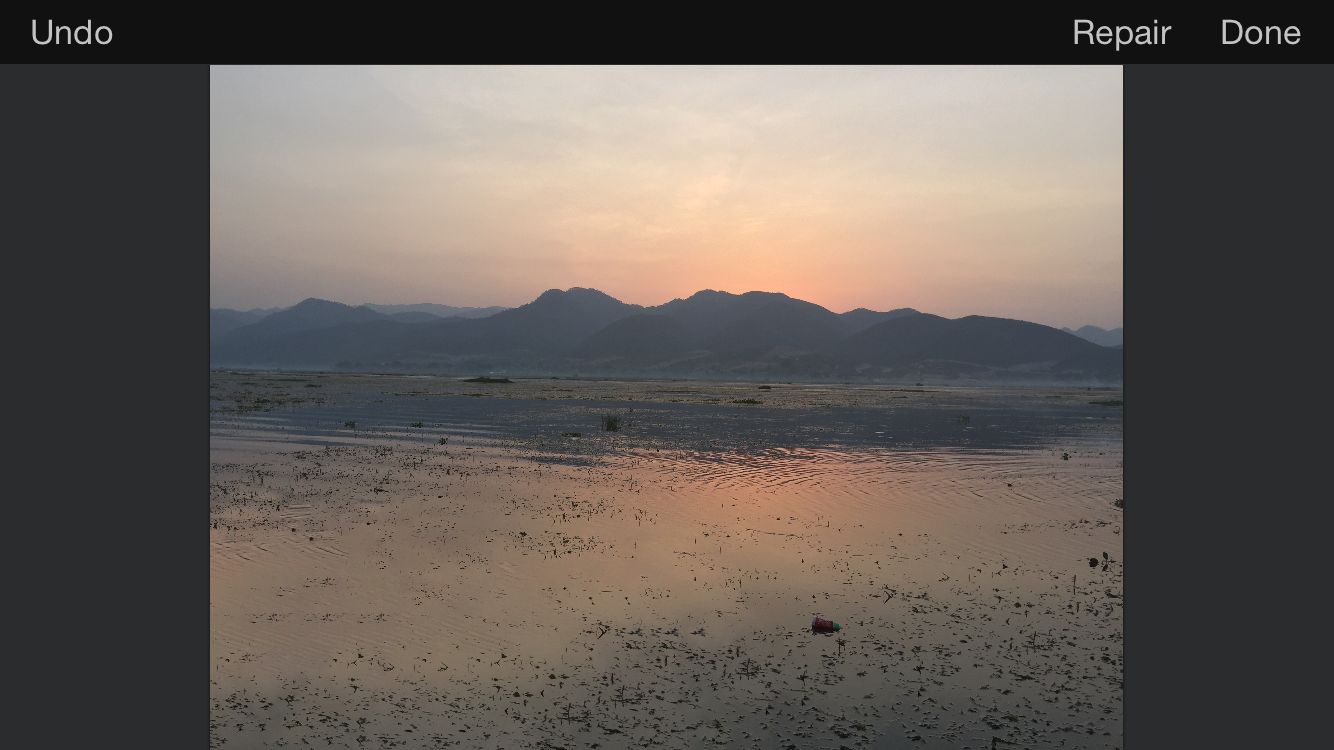 After: Sample image with intelligent repair brush applied.
It really is surreal to take out my phone, open a photo, apply a repair brush with my finger to remove a major element of a photo, then watch it vanish seamlessly several seconds later. The power of these tools is impressive and on par with their desktop counterparts.
The developer supports devices back to the iPhone 4S, but I would be interested in testing performance while using the more robust, processor-intensive features. I have no doubt it would work fine, but you would likely face some stiff processing times. The interface felt great on an iPhone 6, and I imagine would be outstanding on an iPhone 6 Plus with even more real estate. All versions of Pixelmator also support handoff, so you can begin editing an image on one device and quickly transition to another — if you are mid-way through an edit at your desk but need to run, you can quickly bring it up on your phone to finish the job.
When editing a photo, you are generally funneled into one of two workflows: manual edits or filters. These can be combined, of course, but I often found myself going with one or the other.
Not your Grandpa's filters
Filters are nothing new in a mobile editing app, but I must say Pixelmator’s selection and implementation are the best I have seen, especially for users seeking deeper functionality. When opening either the “Adjust colors” or “Add effects” menus, you are presented with an array of filters related to that selection.
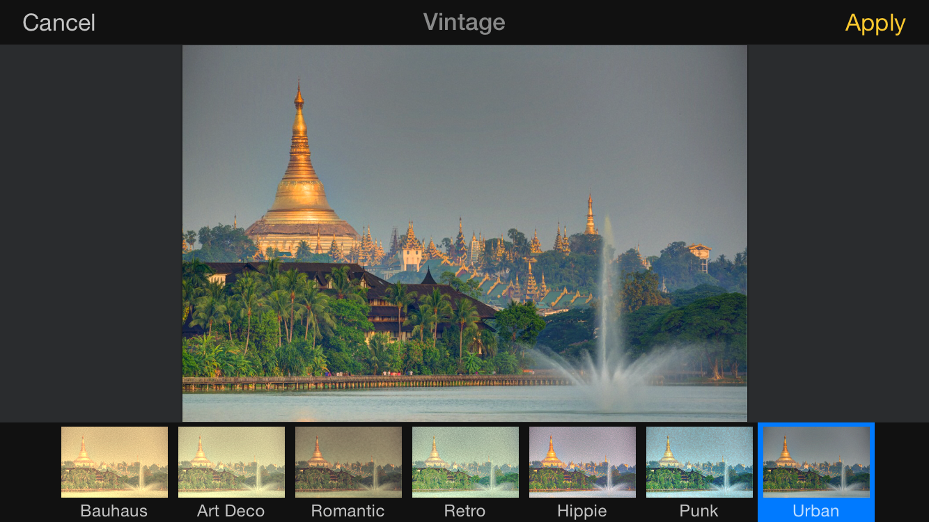 Several filters offer an array of refinements. Here, a sub-menu shows options for refining the Vintage filter.
Each filter has its own refinements that can be made after selection. Some filters are nested, such that you are given a subset of options once a selection has been made. For example, after selecting Black & White or Vintage, you have an additional seven different sub-filters to fine tune your adjustment.
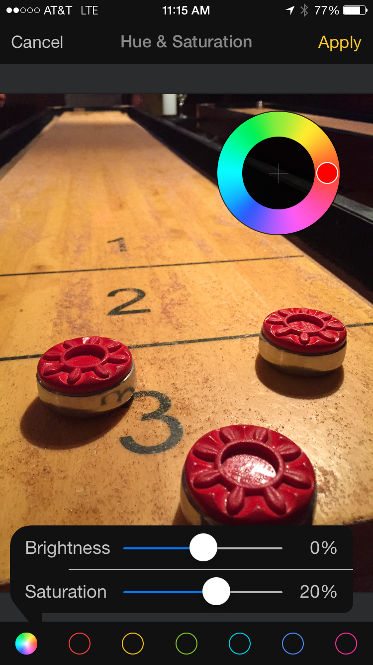 UI elements such as sliders and dials appear on some adjustments to allow fine-tuning.
Others filters will show a variety of on-screen adjustments to fine tune your selection. This interface strikes the balance of being fun (and even sometimes playful) while remaining clean and functional. For example, the “Hue & Saturation” option displays a movable circular gauge as well as a pop-up of sliders to adjust strength of brightness and saturation.
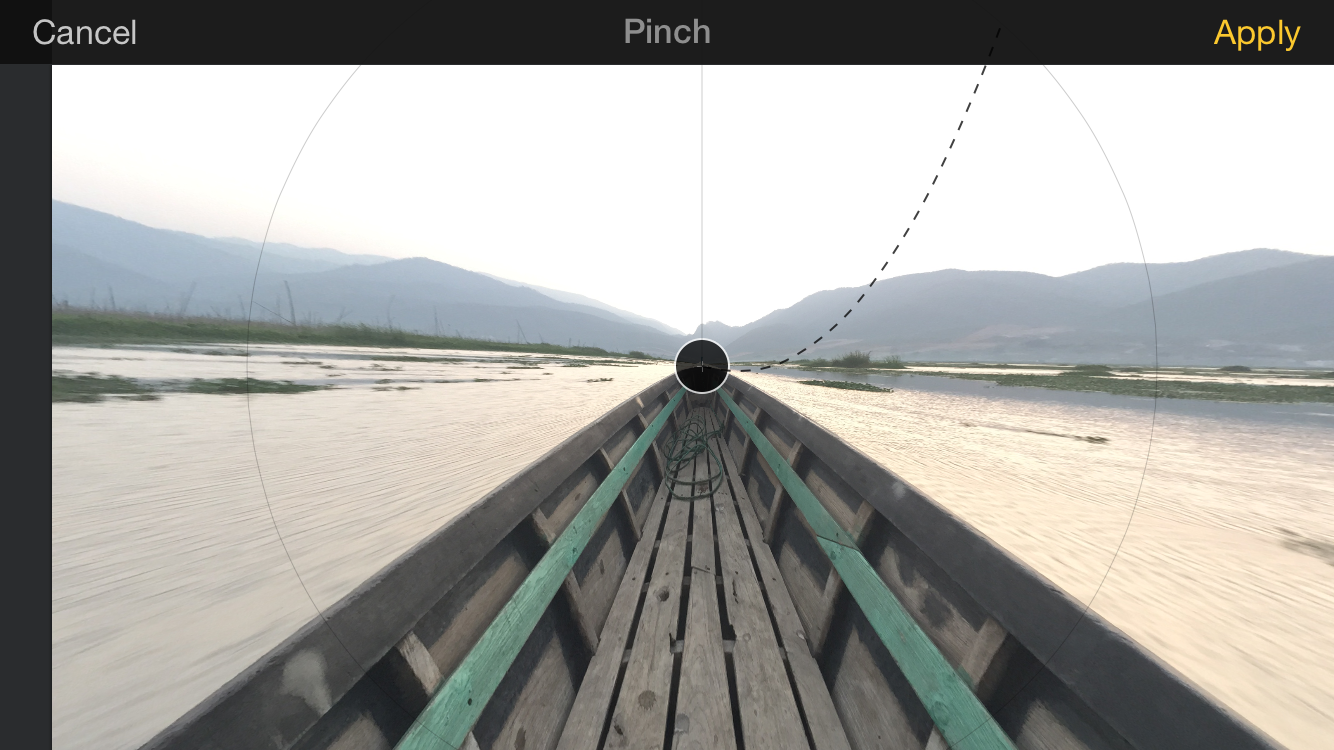 Other filters have selectable points to adjust the size and location of an effect. Playful elements like this “dangling string” lighten the UI without making it feel cluttered.
On several, such as the “Pinch” effect above, you’ll find an interface to select the location and adjust the size of the effect. These tools make the features feel powerful and fine-tuned. In that way, these tools are more robust adjustments masquerading as filters.
Manual adjustments
Although quick enhancements are great, many traditionalists (myself included) will always want the ability to dive in and tweak curves, color temperature, saturation, and other traditional editing elements. Pixelmator obliges here as well, with most of these found under the Adjust Color menu.
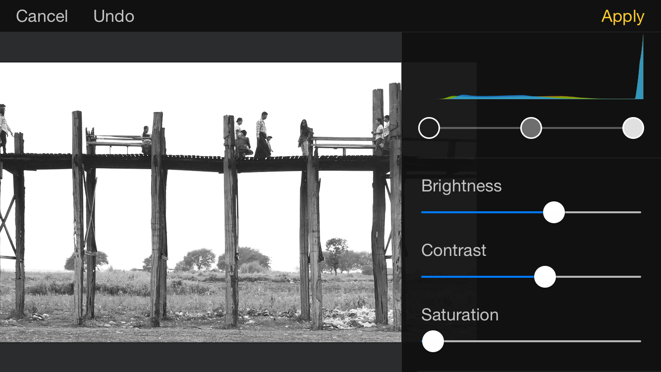 A number of manual adjustments are available as well. Here, I desaturated an image and adjusted levels to simulate a red black & white filter.
Manual cropping and selection are also available, including a variety of select tools (free selection, elliptical selection, magic wand, etc.) and the option to either add to or subtract from a selection. In other words, you could select an elliptical selection from a photo then subtract from that selection using the magic wand. Such a procedure would likely prove too meticulous to be done regularly on a smartphone, but it is nice to know it’s there if you need it.
Additional odds and ends
This release of Pixelmator also includes some interesting “Distort” tools to create stretching or swirling effects in your photos. These are fun to play with, but ultimately not my cup of tea, although your mileage may vary, especially if you often find yourself into surreal or minimalist styles to which these would lend well.
Text overlay support is also provided here, and is extremely intuitive and should prove useful for periodic text edits and additions that come up during my day job. A nice selection of fonts is provided, and the selection and sizing tools are as intuitive as anything else in the app.
Finally, you’ll find a host of arrangement tools provided here, including size adjustments and the ability to rotate or flip images. Layering functionality is also fairly extensive, although I only find myself rarely using layers in a complex way, so I will tread lightly here.
Wrap up
All around, I'm impressed and couldn't give a stronger recommendation for the app. That is doubly true if you own both an iPad and iPhone and edit photos on each – given Pixelmator's Universal architecture, you can buy it once and use it on both devices.
If I had to find areas for improvement, surely I could find a couple, e.g. I would love to see some more sophisticated export options, but this is a minor gripe. If you ever find yourself editing photos from your phone, you should definitely check out Pixelmator for iOS.

Comments
on June 16, 2015 - 3:46am
Great Write-up on Pixelmator for iDevices..
As an avid iPad artist, I can say that Pixelmator is not at all for the digital artist looking to paint on their iPad/iPhone (though they have brushes and all, The canvas not rotating is a big obstacle).. If Art is what you’re after, go for Procreate for iPad and Procreate Pocket for iPhone..
Now for the Photo enthusiast, Pixelmator on iOS is amazing.. the tool I use the most on my iPad is the repair tool.. Although the manual editing options are great aswell (I touched the histogram view and I could adjust my image straight from the histogram without fiddling with options).. time saver. once that is done, further editing is always possible to achieve the perfect edit.
I rank this my second best photo editing iOS app after Snapseed.
My small wishlist:
-add font import options from dropbox: see how the free vector art app “Inkpad” does this.. It would allow for Watermarking with ease.
- import to higher res files.. on my iPad, I can import my CR2 Canon RAW files and edit them from the photos app (i checked with View Exif app on iPad and can confirm that it is a RAW file).. would love to be able to use that CR2 file into Pixelmator and export it back to a TIFF to Camera roll after edit. (maybe it is using the original CR2 file but I would like to have an exif window or something that displays this info - maybe near the histogram in manual edit mode)
- maybe more ideas will come to mind but for now those are it..
With that said, I would recommend this app in a heartbeat to all photo editors on iPad and iPhone but not to painters.
SKR Imaging
https://skrimaging.wordpress.com
on June 16, 2015 - 3:17pm
Thanks for your thoughts, and great idea on the font and import options! It'll certainly be interesting to see where they take the app in the future!