Aperture, Capture One and Lightroom Walk into a Bar (Part 2 of 2)
If you haven't read part one yet, do that first. Part two is all about specific editing features; comparing advantages, disadvantages, and capabilities of Aperture to Adobe Lightroom and Phase One Capture One Pro.
The editing tools
Many Aperture users have the feeling that the editing tools and the image quality of their beloved tool is nowadays subpar to what the competition has to offer. It isn’t difficult to come to this conclusion even after very short experiments with some of the other offerings. As an example, the following photo is too dark. I want to make the whole image much brighter by lifting mainly the shadows — without destroying the lights.
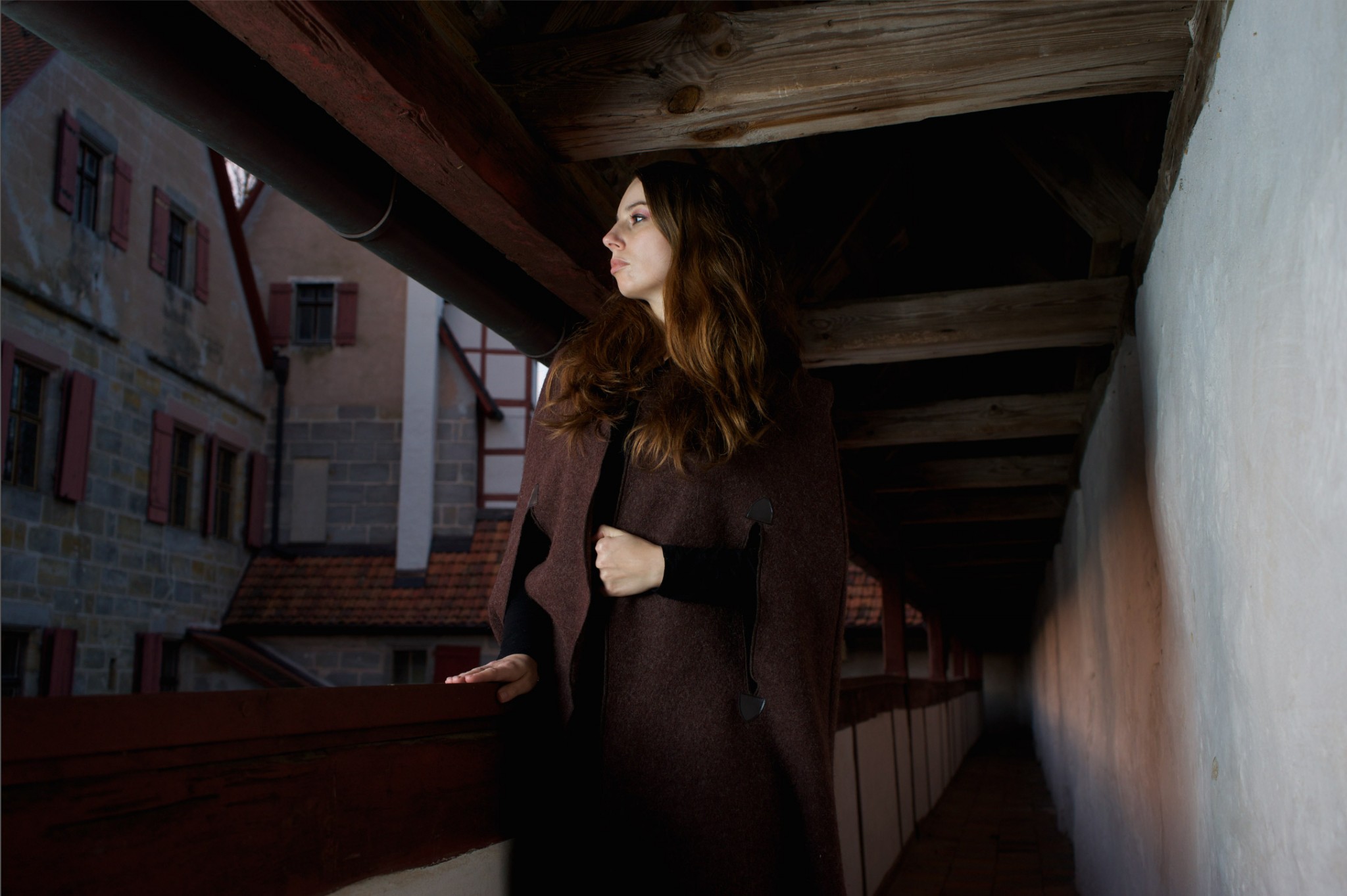 This is the look of the underexposed photo with standard parameters within Aperture, and it looks very similar in Capture One and Lightroom
If I try to correct this in Aperture using “Shadows” in the Highlights & Shadows tool, the result looks chalky, and there are still very deep shadows. If I go even further by increasing exposure and pushing the shadows beyond the sliders normal limit, the result is really ugly. To many users this can look like a natural limit in Apertures RAW engine:
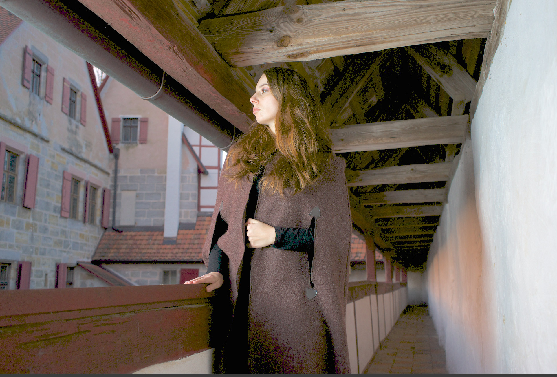 This version shows very ugly shadow artifacts, after raising Apertures shadow slider beyond its bounds and increasing the exposure a bit
So let's try the same thing in Lightroom:
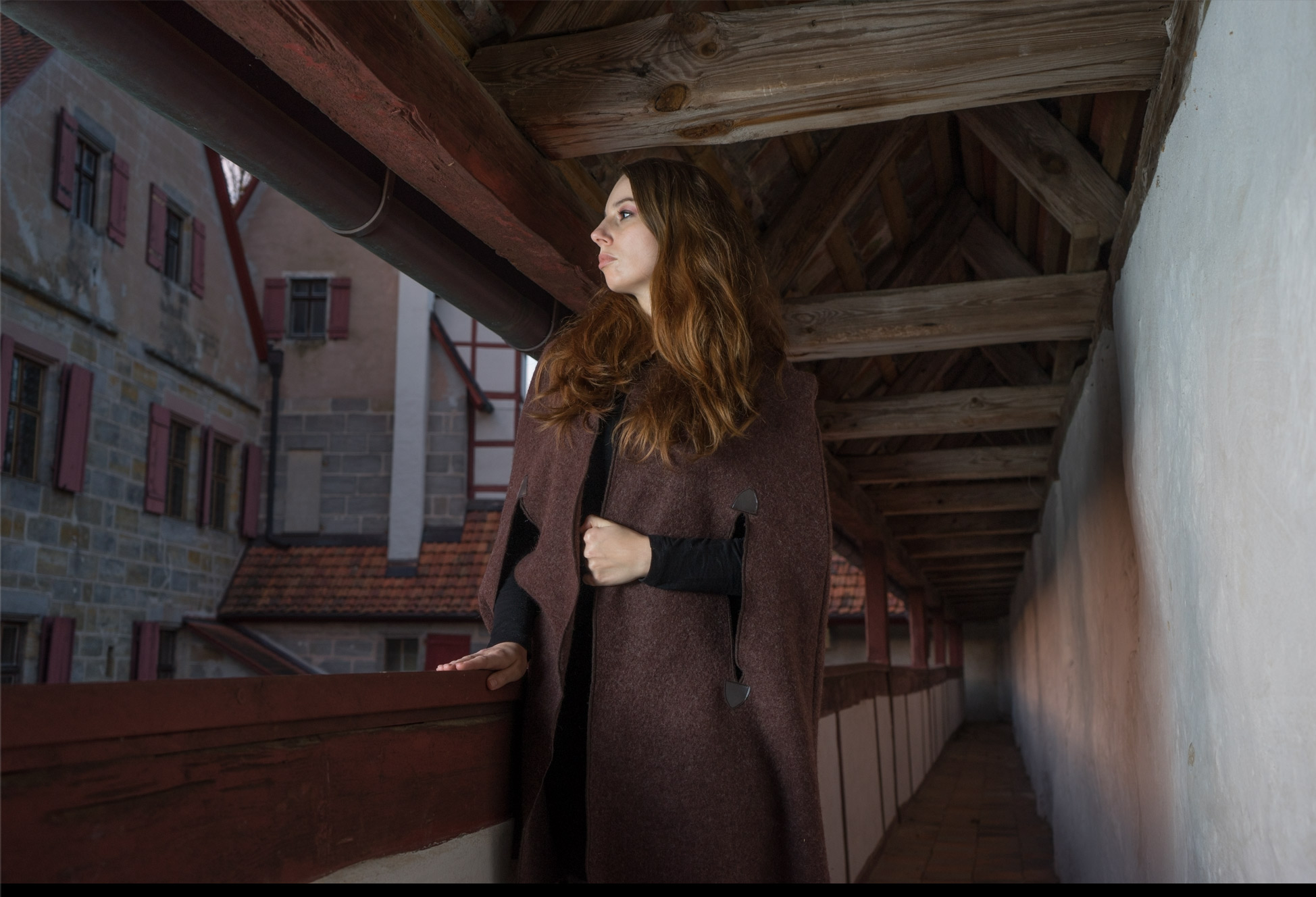 Just pushing the deeps slider up in lightroom delivers a still a bit dark picture without being chalky or showing artifacts
Since the photo is still to dark - I increase the exposure a bit which results in this:
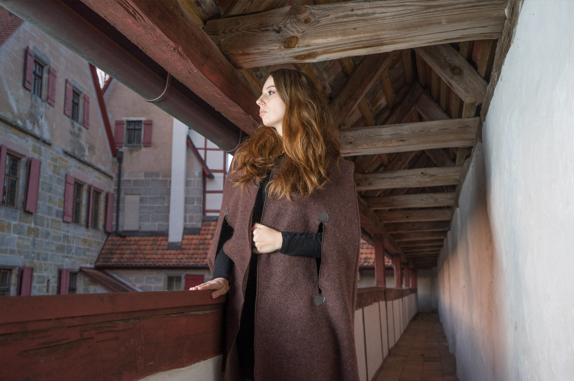 Additionaly to raising the deep shadows I pushed up the exposure a bit
The result is looking much better than the one in Aperture. This example clearly shows why so many users trying Lightroom are shocked about the results they can get.
Now Capture One: by pushing the shadow slider in the HDR tool I get the following result:
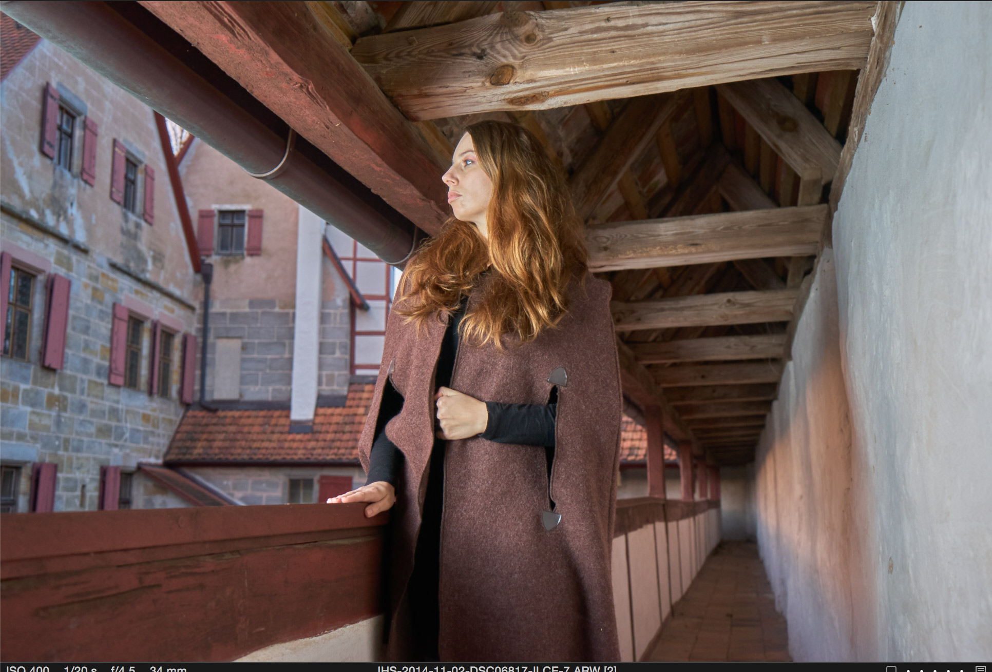 The shadows pushed to 100% in the HDR tools shadow slider in Capture One Pro 8
The shadow slider of Capture One works much stronger than the one in Lightroom. This extreme look is too much though; If I drop the slider back to 50%, I get a result very similar to maxing the shadows slider in Lightroom. By increasing the exposure similar to Lightroom I get the following result:
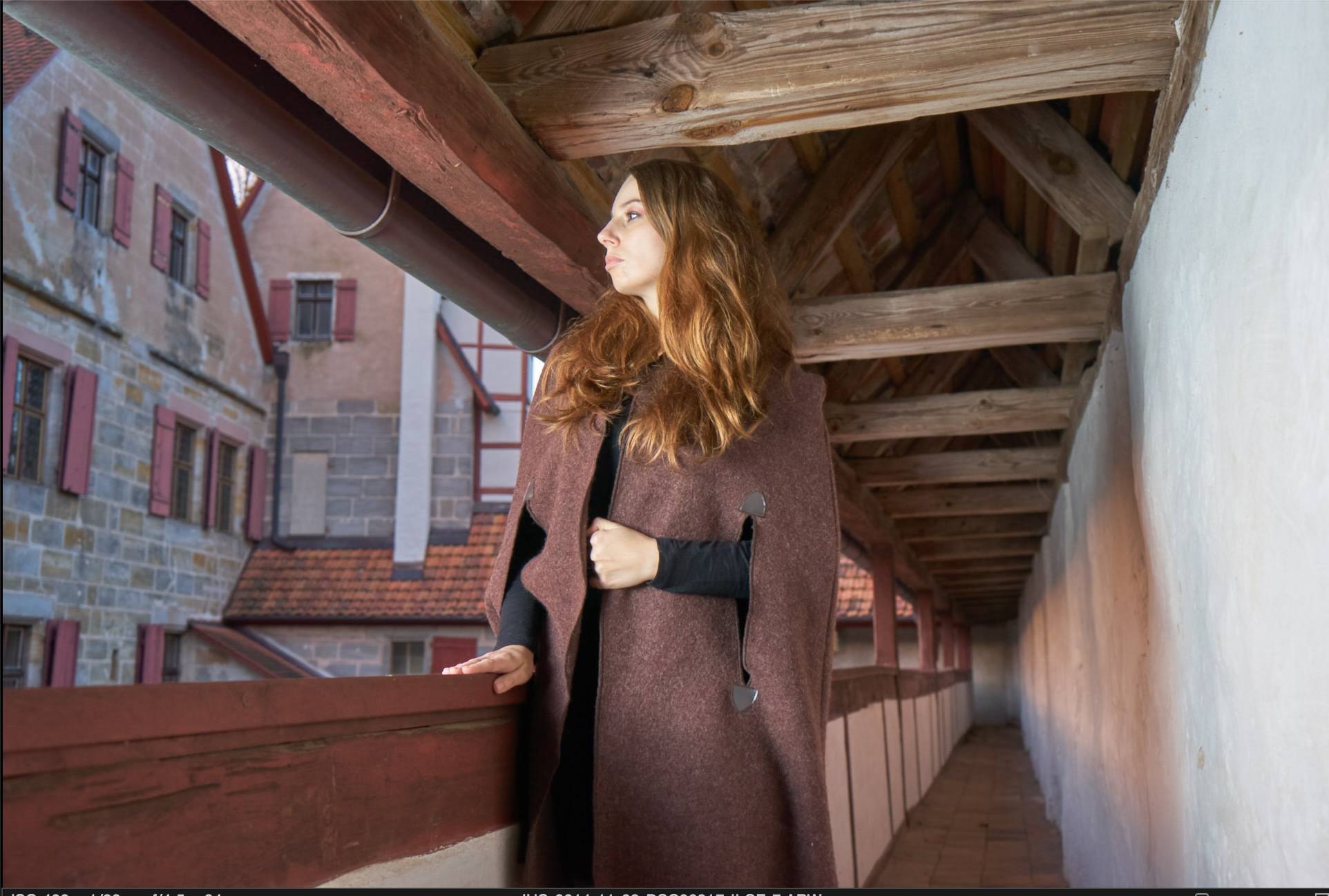 C1 Pro: With shadow only raised to 50 and exposure similar to Lightroom, one gets a result that is comparable to the LR version
With both Lightroom and Capture One I easily can get better results than I got using similar techniques in Aperture. But is this really the whole story? Actually no; this kind of pushing deep shadows out of a photo with high dynamic range doesn’t really work with Aperture's shadow slider. The solution is to drop the black point to zero and use the levels or curves tool to raise the shadows. My curves adjustment for this photos looks like this:
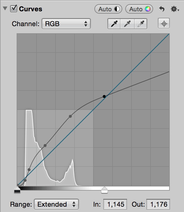 Using the curves adjustment after dropping the black point to 0
The result looks like this:
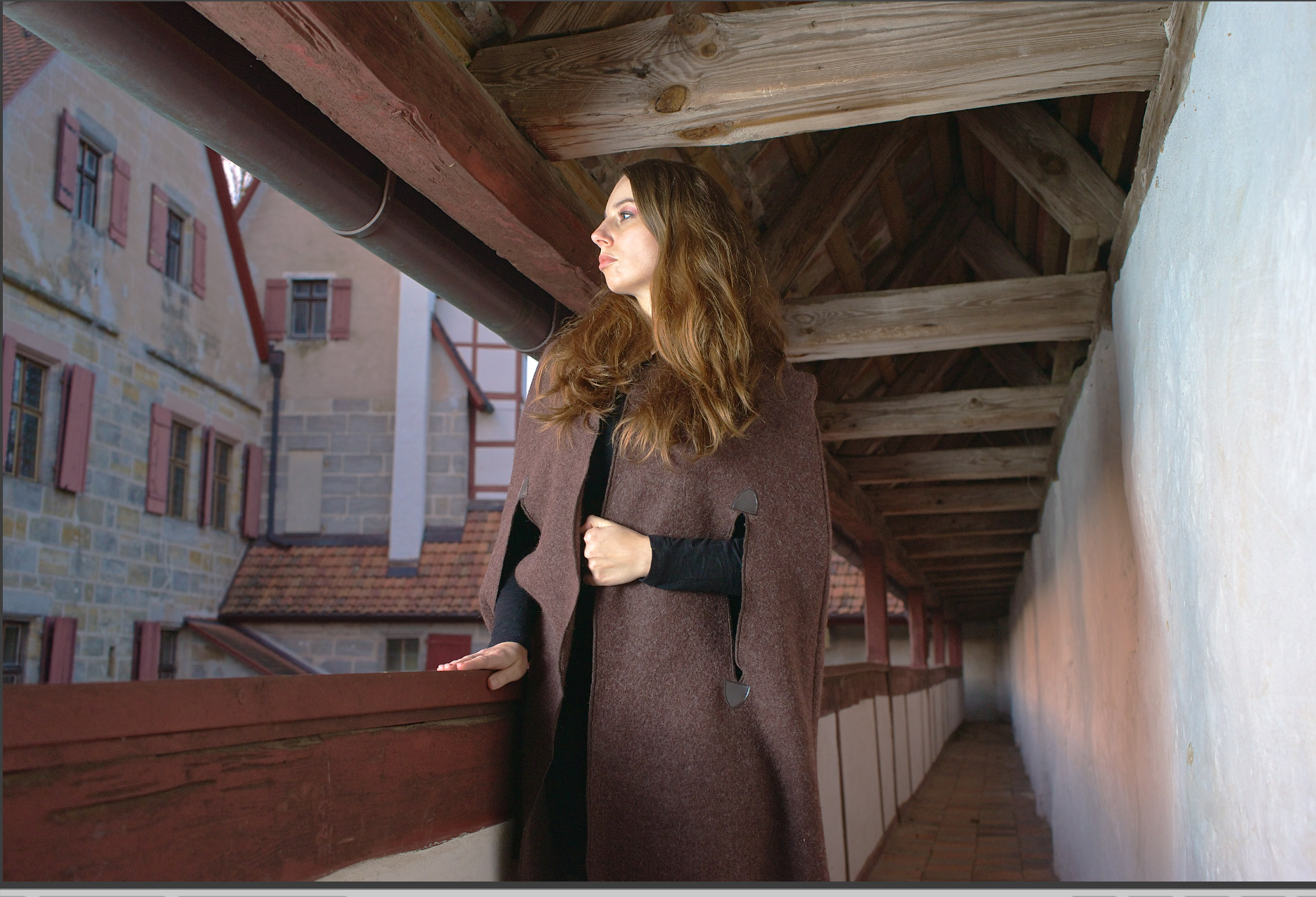 Using a black point of zero and a complex curves adjustment shows, that Aperture is still capable to produce good results, that are comparable to those of the competition
As one can easily see, the ugly artifacts are no more, and the image is much brighter than before. This means that it's not true that this photo shows a limitation of Apples RAW engine — it just takes a bit more custom work to get a satisfying result. When working with deep shadows, it is necessary to drop the black point to zero in Aperture. This makes the image look rather flat, but it is possible to compress the tones using the curves adjustment again.
One fact is undenyable though: It is much easier in Capture One or Lightroom. The reason for that is very simple; the tools in those programs are written with such situations in mind. These are not just simple linear shadow level adjustments; there is a set of non-linear curves behind them which are carefully crafted to give natural results, even in the extremes. This is not a limit of the engine; it is a feature of the user interface which hides such complexity behind a simple linear looking slider.
Local adjustments
Aperture makes it very easy to brush in and out nearly any adjustment; even curves. Not only that, but you can have multiple instances of the same adjustment. This allows some very advanced edits; Photoshop users know a lot of different ways to dodge and burn photos (not only the simple tools), and a very flexible one is to use two curves layers with the midpoint lowered (dodge) or raised (burn). The effect is blended using “Luminance” and simply masked in and out. The best part; you can always adjust it by changing the curves a bit. The exact same technique is possible in Aperture using two curves adjustment blocks. And much more of course.
The good news is, that both - Capture One and Lightroom - provide local adjustments.
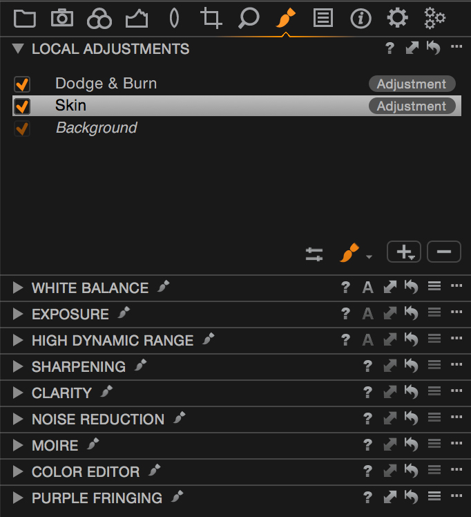 Local Adjustments in Capture One Pro 8.1.1
Capture One implements a very straightforward way using “Layers” similar to adjustment layers in Photoshop. One difference to Aperture though is that each layer can have multiple active adjustments. You can easily change both shadows and exposure using the same mask on the same layer. This is similar to grouping adjustment layers in Photoshop and masking the group instead of the individual layers. With Capture Ones layers, masks even can get moved around, inverted and copied to another layer, which can save you a lot of detail work. Last but not least it is possible to create linear gradient masks. All of these are things many experienced Aperture users have missed in Aperture's masking so far. Not all adjustments are available as local adjustments yet, but Phase One did add some of them in the latest releases. Sadly, the curves adjustment is still missing though. Another limit is, that one can only have up to 16 layers, which is a limit that can quickly lead to problems if one starts to use the new healing and clone layers. Since every healing layer has exactly one “source” you will quickly use up your layers if multiple sources are necessary.
Now on to Lightroom:
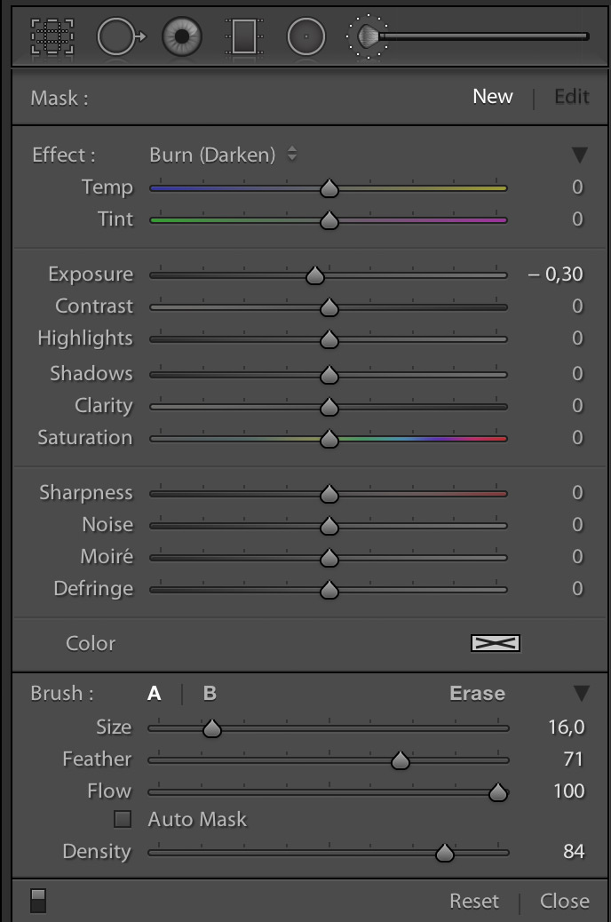 Local Adjustments in Lightroom 5.6
Lightroom doesn’t use layers, but so called “edit pins”. This isn’t a big difference though; each edit pin is associated with a mask, very similar to layers in Capture One. And like there, it is possible to do different adjustments at the same time with a single mask / brush stroke. Brushed Curves are missing, so no difference there. Currently it's not possible to move or invert masks; you can only duplicate a pin (Command-Option drag), which duplicates the mask. The lack of “invert” makes it cumbersome to “brush out” adjustments like in Aperture. Also in addition to the linear gradient mask, Lightroom also provides a radial one.
Editing Colors / HSL
Aperture provides an adjustment to directly edit colors by picking them within the image and then adjusting hue, saturation and luminance (HSL). Like most adjustments, it is also possible to brush this in or out.
Lightroom provides a similar feature with its HSL adjustments. The big difference though is that it works only global (the whole image) and that it just provides a set of eight nominal hues with sliders. There is however a small tool in the top left cursor which activates a mode that enables the mouse to change adjustments by clicking and dragging directly in the photo. This way you can adjust hue, saturation and luminance of a particular color by clicking and dragging on such colored parts in the image. This is an intuitive, explorative way to adjust colors, however I still think that the picker method in Aperture allows for better control of the result. Its really a shame that this adjustment is not available as a local adjustment though, as this really limits its purpose.
If there is one area where Capture One really shines, it's the “color editor”. It works very similar to the one in Aperture. You can pick a color and then adjust hue, saturation and lightness. The “Smoothness” slider is similar to apertures “Range” which allows you to control how exact or “smooth” the color selection is made. Capture One shows the selected color in a nice Lab-Color-Circle with handles to directly manipulate the currently selected color segment. A checkbox “View selected Color Range” controls a mode in which you can see the selected colors within the photo. A special variant of this color editor is for skin tones; in addition to the common HSL and smoothness sliders, the skin tone editor adds a slider “Uniformity” which allows for easily creating more uniform skin tones. And last but not least, the color editor is part of the set of local adjustments, so you can create layers with masks to apply it to only certain parts of your image. Overall, this looks like the natural progression of the color adjustment block in Aperture.
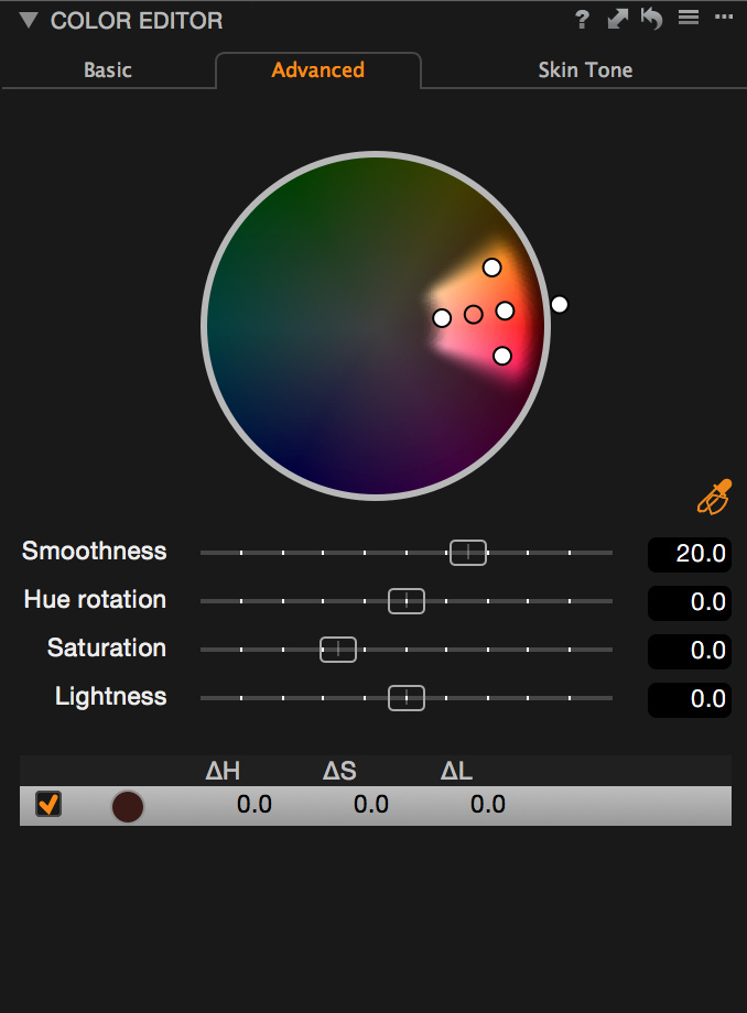 The Capture One Pro Color Editor is quite good
Lens correction
This section is likely a sore spot for Aperture users. Lens corrections were probably the first big feature in Lightroom which many Aperture users wanted but didn't get. To some degree this got remedied by Apple when they started to apply “Manufacturer Profiles” which are more and more common with newer lenses. For lenses without such a profile, there is no further support though. Switchers will be happy to hear, that Capture One and Lightroom both provide lens corrections. There are much more available lens profiles for Lightroom though, which certainly is the effect of the lens profile creator tool Adobe provides.
Another popular feature of Lightroom 5 is “Upright” which is a tool to correct perspective in your photos. The counterpart in Capture One is called “Keystone”. Like with the lens corrections, there is nothing like this in Aperture, so this is another plus. This is not only useful for architecture; controlling perspective and how things line up can really make the difference between nice and “wow” in any genre.
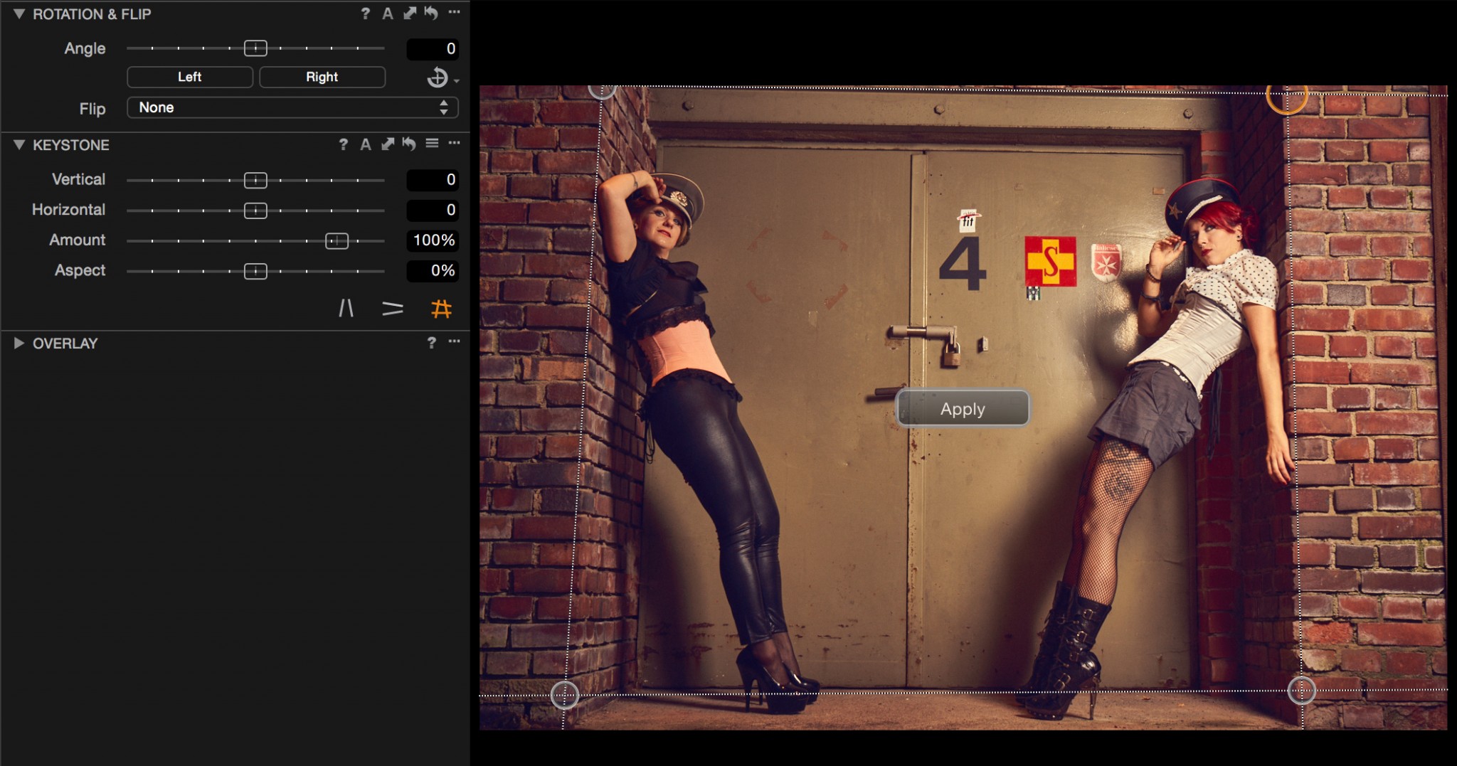 Capture One’s Keystone tool
Summary
Users switching from Aperture to Lightroom or Capture One will get a whole set of new and useful features. The biggest challenge is always to learn the new tool. One shouldn't be demotivated if it will take some time to come up to one's familiarity level again.
Both applications are very capable of being used in a professional workflow. There are even many of professionals who are still happy and efficient with Bridge and Photoshop alone. Aperture users are used to an efficient and supportive workflow which is something you don't want to give up easily. Neither Lightroom nor Capture One are a 100% replacement to a sophisticated Aperture workflow. You will have to adapt.
When comparing Lightroom to Aperture I mostly miss the ease of use. While Lightroom's tools work exceptionally well, the user interface and the catalog organization is something you may really have force yourself to like. I still miss brushed color and curves adjustments. I really like the Lightroom iOS app. Since I didn't really use maps, books or slideshows in Aperture I cannot say if the ones in Lightroom are enough to be a replacement. When it comes to scripting, Lightroom plays the misfit; it's done in 'Lua' which isn't a bad scripting language, but even the rest of even the Adobe-World is using JavaScript today and most programs on Mac OS X allow scripting through Open Scripting Architecture [OSA] (i.e. AppleScript, Automator…). I don't need another language to learn.
Capture One doesn't only look similar to Aperture, it has a lot in common. The UI is more like Aperture and more configurable than Lightroom. The quality of its output it often said to be better than Lightroom. I think it is difficult to make this point because so much is subjective or depends on how you use the program. I can agree though that things like the shadow slider have more effect in Capture One when compared to Lightroom and I like the handling of highlights better. I really like working with colors in Capture One. Anything about the catalog system is quite new, which can mean that it is incomplete or even buggy. I did face some performance problems with big catalogs converted from Aperture libraries. The catalog system is new and there are certainly missing things or opportunities for optimization. Capture One has more local adjustments than Lightroom and is more flexible when working with masks. Scripters can rely on the OSA (AppleScript/JavaScript) interface.
Lightroom is still installed on my system as I've had it for many years, and sometimes I try things in it or test new versions. But I personally have now started to use Capture One for new projects where I used Aperture before.
More like this
- Tip
- Tip
- Tip
- Tip
- Tip

Comments
on March 16, 2015 - 9:25pm
This is similar to my experience. Both Lightroom and Capture One have somewhat better develop tools. Aperture is far and away better at photo management.
Development:
C1 > LR > AP
Management:
AP > LR > C1
This is why Lightroom is so popular - it’s not best, nor worst, at anything. And it’s from Adobe.
Bob
----------
Bob Rockefeller
Midway, GA
www.bobrockefeller.com
on March 17, 2015 - 12:25am
I use Lightroom at work, but it never felt as comfortable as Aperture, even 5 years later. I have been experimenting with Capture One and like it as the best Aperture replacement so far. The most annoying missing features for me are global before and after (WTF? This is such a basic feature. You can do before/after only on each adjustment brick). The second is red-eye removal. It can be done with adjustment layers in Capture One, sure. But, when I’m doing event photography and there’s a crowd scene I miss the one click fix of Aperture.
on March 17, 2015 - 9:21am
I miss that old “M” key from Aperture as well.
One reason why this is not implemented could be that there is no actual “baseline” to which the image could be referred to. In Aperture, Core Image from OS X provides this baseline. What you see after pressing “M” is actually what you see when you open a RAW file with Preview in the Finder.
But this is just speculation on my part.
on March 17, 2015 - 10:12am
To me, the checkboxes on each adjustment would be more important than the M key. In Capture One you option click the adjustment undo icon and it only works while holding that combo. This is uncomfortable to me and doesn't allow deselecting multiple adjustments.
http://neonsqua.re
on March 17, 2015 - 10:20am
You can implement a pseudo-before-and-after in C1 by creating a New Variant (top item in the Image menu – I’ve changed its shortcut to Alt-G to match Aperture). Obviously this isn’t quite as nice as just pressing a key to toggle ‘Original’ on and off, but it’s close, plus you can have both versions/variants visible at the same time.
on March 17, 2015 - 12:31am
Jochen, Thanks for the great comparison review in these two parts! Very thoughtful and great, helpful information. I know that in Lr there are brush adjustment presets that can be obtained, but I do not know how to create any (at least I have not mucked around in Lr long enough to see how it can be done). I’m wondering if there is a curve adjustment brush that could be created and the effect altered by using the opacity slider. Anyway, maybe a curves brush will show up in Lr 6. I chose the Lr fork in the road where the Aperture road ended and for me I am adjusting, learning and moving through it easier each time I use it or struggle and make mistakes and learn some more. Just like I did when starting Aperture. Each of us has our own unique way of working and our own individual needs. Looks like Capture One and Lr are two good paths to choose from. I’ll leave it up to Robert Frost’s ghost figure out which eventually will be the road less travelled by former Aperture users. :-)
Thanks again for all of the hard work and the effort to put this together for us.
Florian
Florian Cortese
www.fotosbyflorian.com
on March 17, 2015 - 10:20am
The important points about a curve adjustment brush are:
1) You can modify the curve at any time
2) It should be possible to brush multiple different curves
3) Ideally there is a luminance mode that doesn't affect saturation
http://neonsqua.re
on March 17, 2015 - 11:58am
I encourage you, or anyone else who has suggestions, to open a case with PhaseOne and submit your suggestions. They seem very open to our suggestions, especially coming from Aperture. It is in their financial interest to attract Aperture users vs losing them to Adobe.
Photographer | https://www.walterrowe.com | https://instagram.com/walter.rowe.photo
on March 18, 2015 - 7:33pm
I have now switched to Capture One after using Aperture for about 7-8 years. I have no Lightroom experience. Here are my observations, which I hope will save others some of my headaches.
Two positive things:
1. With C1, I can achieve my desired image quality at least as fast or faster (even being new to C1) as with Aperture. C1 also has perspective control. So, all around it is preferable.
2. The import did a good job with importing my changes to the images. It’s not perfect, but given that C1 is interpreting a completely different RAW-processor, it was quite impressive.
The problems I have encountered with C1 lie with the DAM. These are:
1. Importing the Aperture library requires a clean library, with all images either as referenced or as managed images. Inadvertently, I had a several hundred managed images among my thousands of referenced images. This messed up the import, which I then had to repeat. I recommend the following workflow:
2. After importing, you should select your hard drive (under “Folders”), do a right-click and choose “Locate…”, and finally select your hard drive icon and click the “open” button. The reason is that the import seems to select the (usually hidden) Unix file folders. With the steps named above, the paths get remapped to the correct ones (that we usually see in the Finder).
3. After importing the Aperture catalog, the “User Collections” section has a strange duplication. All of my Aperture Projects were correctly imported as Projects in C1. But, within each C1 Project appears a C1 Album with the same name and the word “images”. Hence the structure came out:
(Folder): I group by year
- (Project): “20140312 | Birthday Party”
This is obviously caused by the difference in the basic container philosophy of the two products (projects vs. albums). I am currently in the process of raising all C1 Albums one level, and in some cases grouping them into projects.
4. When using the Catalog in C1, you can only delete (= move to trash) an image from the “Catalog Collections” section, not from the “User Collections” section. User collections rely on albums as basic containers. But, when you try to delete an image there, it only removes it from the album. The developers probably call this a feature, but I see it as a fundament contradiction between the purpose of a container and a virtual link. Since the “User Collections” are the only place a user can manage his/her images with folders, projects and albums, deleting images from this collections is vital to good image management.
A workaround kindly provided by Image Alchemist (see the answer to my question here) is to tag the rejects (with tags or keywords), then switch to the “Catalog Collection”, search for them with the tag and then delete. Tedious, yes.
For item 4, I will definitely write it up as a suggestion to Phase one. It just makes no sense not being able to delete images from the one place where a user can actually manage them. I trust that they will improve the DAM aspects with time.
Best of luck to all.
on March 18, 2015 - 7:45pm
Sadly, this is all true. C1 is a very good image processor and a very bad DAM. You can’t even stack images (other than virtual copies of the same image). Keywording in C1 is laughably incomplete.
There are no printer pre-sets forcing you to set up to print each and every time.
I like the C1 workflow as it does feel a lot like Aperture.
But with such immature DAM features, I guess I’ll end up with Lightroom. Maybe the rumored-to-be-soon version 6 will make it better somehow.
Bob
----------
Bob Rockefeller
Midway, GA
www.bobrockefeller.com
on March 18, 2015 - 11:57pm
Given that Phase One also owns Media Pro, and Capture One now incorporates some of those features, we can only hope that they continue in this path and incorporate more of Media Pro's DAM capabilities. We can also hope that the continue to develop the catalog collections features. For those selecting Capture One, make your wishes known by going to the Phase One web site and opening cases to request the features you want. I certainly have.
Photographer | https://www.walterrowe.com | https://instagram.com/walter.rowe.photo
on March 20, 2015 - 9:39am
I’ve compared both Lightroom and C1 over a span of three weeks and used them for many hours in all kinds of scenarios.
I finally came to the conclusion, that the immaturity of C1’s DAM is on the long run less of a problem to me than the immaturity of the user interface in Lightroom. I can handle DAM issues with taking care of my pictures myself like in the old days before Aperture, but I can’t stop Lightroom from having me switch between “Library” and “Develop” 150 times a day or ignoring my second monitor for useful features.
on March 20, 2015 - 11:37am
Thats a very good point and actually 1:1 on how I feel about it. I've watched LR for more than a few weeks, but never saw any trend into a kind of user interface that I feel able to accept in the long run.
My experience with Capture One Pro is not that long, but a lot happened in the last releases that pushed it further and further in a direction that feels right. When round tripping came this was the last piece to me, that made me decide that I will now seriously try it as an alternative to Aperture. There is still a lot to do though!
http://neonsqua.re
on March 20, 2015 - 1:14pm
I suppose you don’t use keywords, but I’m finding them to be an important part of a modern DAM system. C1’s keyword approach is so comically bad that I can’t find a way around it. Maybe I could live without stacking of different images, but I do a fair amount of that, too.
Working around problems in Lightroom is also a constant struggle, as it is so different from Aperture in some ways. The context switch from Library to Develop is perhaps the most glaring - Lightroom folks don’t seem to even see it as a context switch. I “get by” with the ‘d’ key for Develop and then back with the ‘g’ key for Library (Grid).
Has anyone has success in starting out with Photo Mechanic? Can you go back into Photo Mechanic later and change keywords and have the changes picked up by C1?
Bob
----------
Bob Rockefeller
Midway, GA
www.bobrockefeller.com
on March 22, 2015 - 3:28am
Bob: Yes. C1 and PM can “talk” to to each other. Using the “Structured Keywords” dialog window in PM is a great way to set up a hierarchical system that will be read in C1. Just make sure your C1 preferences (Preferences>Images>Metadata) are set on full synch with XMP.
FirstName
on March 19, 2015 - 12:38am
For #2 (“Verify consistency of image location”), it shouldn’t be tedious. In Aperture, create a new Smart Album that filters on referenced files. Then you can select them all and consolidate them. I wouldn’t call that tedious.
on March 19, 2015 - 3:40am
That’s pretty much what I do, except I just use the Search bar and use File Status: Managed on the folder I’m targeting. I then relocate them to my referenced location. I use this whenever I drag-and-drop images into Aperture (for convenience), which by default makes it managed.
I started moving my files out to external drives some time back as my Aperture library was eating up my hard drive, and I also have two separate libraries, one for personal and one for professional work on separate drives.
After it became apparent Aperture was no more, I have been gradually making sure nothing was managed, as I don’t want things stuck inside the Aperture library bundle; I want them organised my way in a location of my choosing. I still have to go over my older photos, I worry about doing too much in one go, in case it causes a crash or something.
I would also like to write metadata to the files themselves, which are all dng or jpg, to reduce reliance on the Aperture database. I’m not sure if it writes location data though.
on March 19, 2015 - 9:00am
That is a great tip. Too bad I didn’t think of it as I was preparing my library.
I did it manually by visually scanning the badges (which was tedious). Fortunately, I could narrow the timeframe to a six-month period, based on a few other clues to my use of Aperture.
on March 22, 2015 - 10:37pm
You can use the ‘Relocate Originals’ tool in Aperture to automate a new file hierarchy and then import that into the new Dam.
on April 5, 2015 - 10:26pm
Why I choose Capture Pro and a tip to make editing a lot more user friendly.
When Apple announced the end of updates for Aperture I wasn’t too worried as I realized it will work for many years to come just as iWeb and iDVD still work on new macs, at least if you have access to those disks.
I did want to hedge my bets though and I started looking at other photo managing and developing programs. Lightroom I hated from the offset, I know many photographers love it and I respect that, but I truly disliked the interface and modules. Lightroom also had a big failing in that while it had a few features that Aperture did not, it was not really better or worse in image quality and if I was going to switch I wanted something with a better finished product even if the work flow wasn’t as easy as Aperture.
I tried DXO and while being a very competent program, with some really nice features, such as Clear View, but I wasn’t blown away.
Capture Pro One 7 was the program I ended up choosing because my photos just looked better! The interface was clunky, the price high, but the images looked great. I wasn’t that happy with not having round-trip access to my Nik and Topaz plugins, but I could always export out to Photoshop as needed. I also wasn’t that happy about using Photoshop in my workflow as with Aperture and my plugins I hadn’t opened up Photoshop in nearly a year. Not that I don’t like Photoshop but I had no need to open it!
With the release of Capture Pro One 8.1 and the introduction to round tripping to Photoshop and directly to my plugins I have that added flexibility back in an easier workflow.
OK enough of that and here is my tip! One thing I liked about Aperture was being able to click on the Adjustments tab and not only see all my adjustments but to customize the default list. Capture Pro, like Lightroom works under the module mode where you have to remember what tab a certain tool is located, I hate that! I mean I really hate that. What I have done is to customize the local adjustments tab to have all the tools I want to use and I only go to that module to edit with. In Capture Pro I can also position the tools in any order I want, and add more than one version of the same tool with the use of the adjustment layers.
This simple set up makes using Capture Pro so much more user friendly and with the addition of round tripping to Photoshop and plugins my workflow is now complete and more importantly my photos look better than ever.
aussiearn
on April 13, 2015 - 2:40am
What a great thread! I am getting ready to make my move and, so far, the scale is tipping towards Capture 1 with PM as my DAM.
on July 2, 2015 - 11:27pm
Hi. Thank you Jochen and all the commenters for the careful and worthy advice. I am a daily user of Aperture, and have taken full advantage of the DAM faculties. Unfortunately for me, I am also sensitive to UI’s, both in software, hardware, and real-life. My reaction to LR has not changed since I first tried it several years ago: I hate it like a dog hates a straightjacket. So I will give C1Pro a concerted trial.
Again — thank you for the very useful report.
—Kirby.
www.kirbykrieger.com
on July 19, 2015 - 9:26pm
I have been using C1PRo for a few months. The learning curve is certainly a little steep at first, but I remember my initial struggles with Aperture all those years ago. One thing I highly recommend is the Phase One YouTube channel. Their tutorials are indispensable. They’re very customer-oriented as well. I am now a true convert. The interface is very customizable, and the catalog zips along much faster than my Aperture did. New features and tweaks seem to pop up every couple of months. They take their software seriously and it is great software for serious photographers.
on January 24, 2016 - 3:28pm
I am a “committed amateur” with high aspirations more than results to show,… and after reading these 2 posts I will continue delaying my move away from Aperture (its January 2016 when I write this, and I updated to El Capitan with no problems in Aperture so far, on both Macs).
I might stick to Aperture 3 mainly for 3 reasons:
Finally, I did try LR trial and I hate the GUI and organisation as much as I do most non-Apple products. And it is so more expensive, and would not upgrade for free!! I hate to give so much money to yet another software giant that is inferior and less customer oriented (lets leave aside how Apple ditched us, for a while).
Am i missing or wrong on something? Any differing opinions? In a recent web-training session, Joe was aligned with the idea of not jumping out of Aperture if one does not feel the need or urge to do so. It works perfectly fine and might still do so for a long time.
P.S. A final thought becomes apparent: Do we hold a chance Apple brings Aperture back to life? It seems it is yet the most obvious best solution for users, with a little upgrade on tools! Can we influence that a notch?
Federico @ Buenos Aires, ARG
on January 24, 2016 - 4:12pm
I, too, love Aperture. But I find that its image processing technology has, in fact, fallen behind that of Lightroom or Capture One. I, too, can’t really love Lightroom.
But Capture One Pro is growing on me. I find that its DAM has become “good enough” (after they fix a few keywording bugs) and its image processing is at least as good as Lightroom’s, but probably better. I know I get a better starting point with Capture One than anything else.
I’ve been attempting to document my odyssey here: http://www.bobrockefeller.com/topic:photography/tag:capture%20one%20pro
Bob
----------
Bob Rockefeller
Midway, GA
www.bobrockefeller.com
on January 24, 2016 - 11:47pm
I made the switch over to CP1 Pro 8 and upgraded to 9. Since I want to work with Catalogs, I decided that I needed a fast culling program to select the Raw files that I want to import into CP1. I went with FastRaw Viewer. Now that I have actually been working with both, I have found a problem with FRV (may be settled by tech support). When I select the files that I want to import into CP1, they are tagged/labeled with a ‘star’ and copied into a Favorites Folder called ‘Keepers’. The issue is that the original Creation Date of the file is updated to the date that the file is copied into the Keepers Folder. Unless corrected, this will not work out for me. For those of you using CP1 as their DAM; are you working with Catalogs or Sessions? If I use a ‘dummy’ session to reference my files on the memory card, can I use this to select and move the files that I want to import into CP1? Will this provide the same function as I thought with FRV? Thanks for any help.