00:00 In this video, I'm going to show you how to crop your photos for Instagram to maximize screen real estate, how to crop them to show the entire vertical or horizontal photo on Instagram and how to create two and even three tile wide images for swiping in Instagram all without leaving your smartphone.
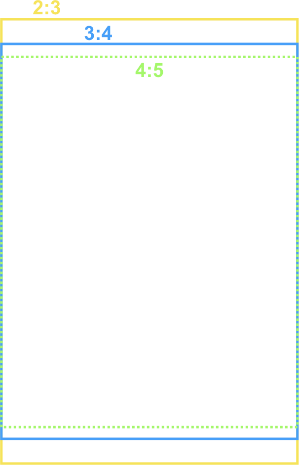
00:27 We all know that it's best to take up as much screen real estate as possible in Instagram, which means ideally posting vertically cropped photos or at minimum square but never landscape. But some photos need to be seen in landscape and some vertical photos don't crop well to the Instagram ratio. Most digital cameras shoot in a 3:2 aspect ratio and micro four thirds is 4:3 ratio. However, Instagram props to a 5:4 ratio. So pretty much no matter what, you're cropping. If you want to post your images without cropping, you have to add borders to them, which is typically done in Photoshop on the desktop and then copied to a phone for posting. And another option, if it fits the format of your photo, is to make an image that's two or even three tiles wide, so the viewer has to swipe to see the entire photo, which also usually requires going to the desktop to edit the photo,
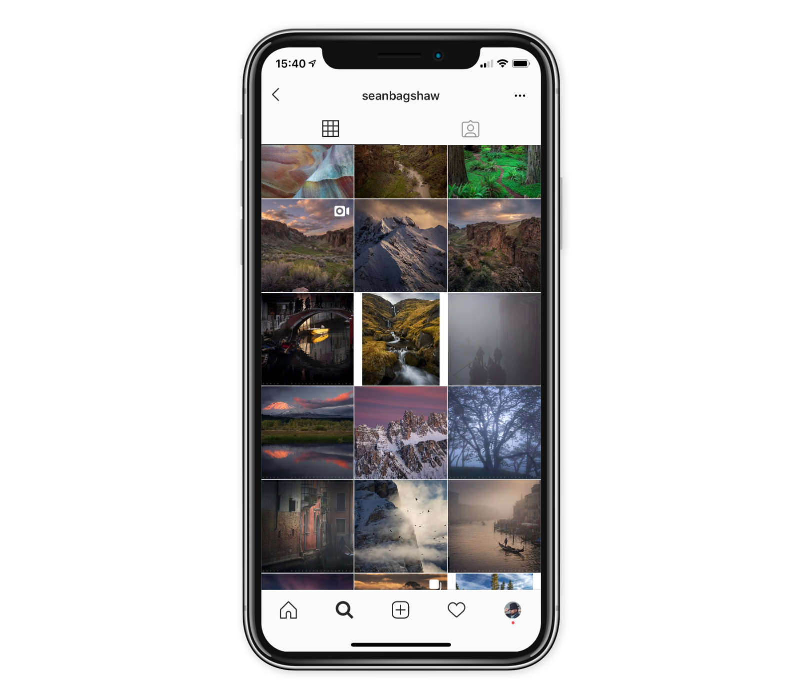
01:09 then sending it back to the phone for posting. I was inspired to make this video because my friend Sean Bagshaw made a video for showing how to crop for Instagram in Photoshop on the desktop using the Tony Kuyper tools, which was really cool. I'll link to his video at the end. And in his video, Sean also pointed out that even if you do decide to add borders to your images to maintain the full aspect ratio of the original shot, that you should also include an image that is cropped to Instagram's preferred size because not only does it fill up the screen to capture the attention as the viewer scrolls by, but also it makes your thumbnails look better. Borders on the image will show up in the thumbnail view, which definitely looks bad. Sean's video was all about doing this on the desktop, so I wanted to show you how to do this on mobile. So let's get some numbers out of the way. As of the recording of this video — in mid 2019 subject… to change…
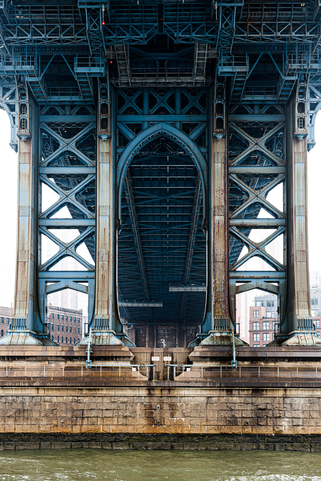
01:53 Google is your friend here… don't be afraid to search for the latest numbers — Instagram publishes photos at 1,080 pixels wide and up to 1,350 pixels tall. It can be as little as 566 tall, but since we want to take up maximum screen real estate, I'll be using 1350 tall throughout this video. Finally, I manage my photos in Lightroom, but it doesn't matter what you're using as long as you have high enough resolution photos on your phone, the process for cropping the photos doesn't change. Also, I've written up a text version of these tips on my website, which I'll put a link to at the end of this video. All right, let's get started. So I'm going to start with this photo here, which is shot in 3:2 aspect ratio. And if we look at the crop thing here, you can see it's uncropped yet and, well, it needs a little bit of cropping to begin with,
02:34 so I'll just leave it at the native ratio. Let's bring that in a little bit like so. And if I send this to Instagram as it is, it is going to want to re-crop the photo 'cause it's not the 5:4. So I'm going to now crop this for Instagram. I'm going to go to the share menu, tap on “open in” and at this point I'm going to use the small limit size, the 2048 — there's also the option within Lightroom to use the maximum available, but I don't need that yet. But I in the future. Photoshop Mix is the tool that I'm using here. You see it says copy to Photoshop Mix here. And incidentally, if you haven't seen this before, you can rearrange these icons on here. Just tap and hold and drag it around. Photoshop Mix is what I want. The first thing to do in Photoshop Mix is to set up the canvas to the optimum size for Instagram.
03:15 So to do that I go to the crop menu and then at the bottom here in the middle you'll see it says “Custom”. Tap on Custom… and what I'm creating in here is not just aspect ratio but the actual size of the image that I want on Instagram. So that's going to be a width of 1,080 pixels and a height of 1350. Tap OK, tap the check mark and now I've got a canvas that is that size and I can rearrange or resize my picture however is needed in there. There we go. So I'm going to start by filling the space so I could do this crop part of it in Lightroom. But since I'm going to crop in here, I just kind of do the whole thing in here. I may as well. So I'll go ahead and crop this out. Let's make that fill the screen on the width and you'll see there, you can see that it really snaps to the edges very nicely,
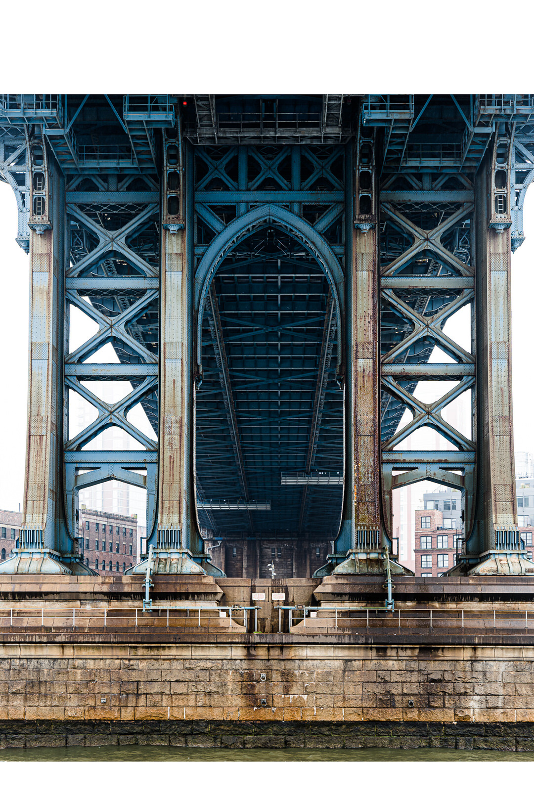
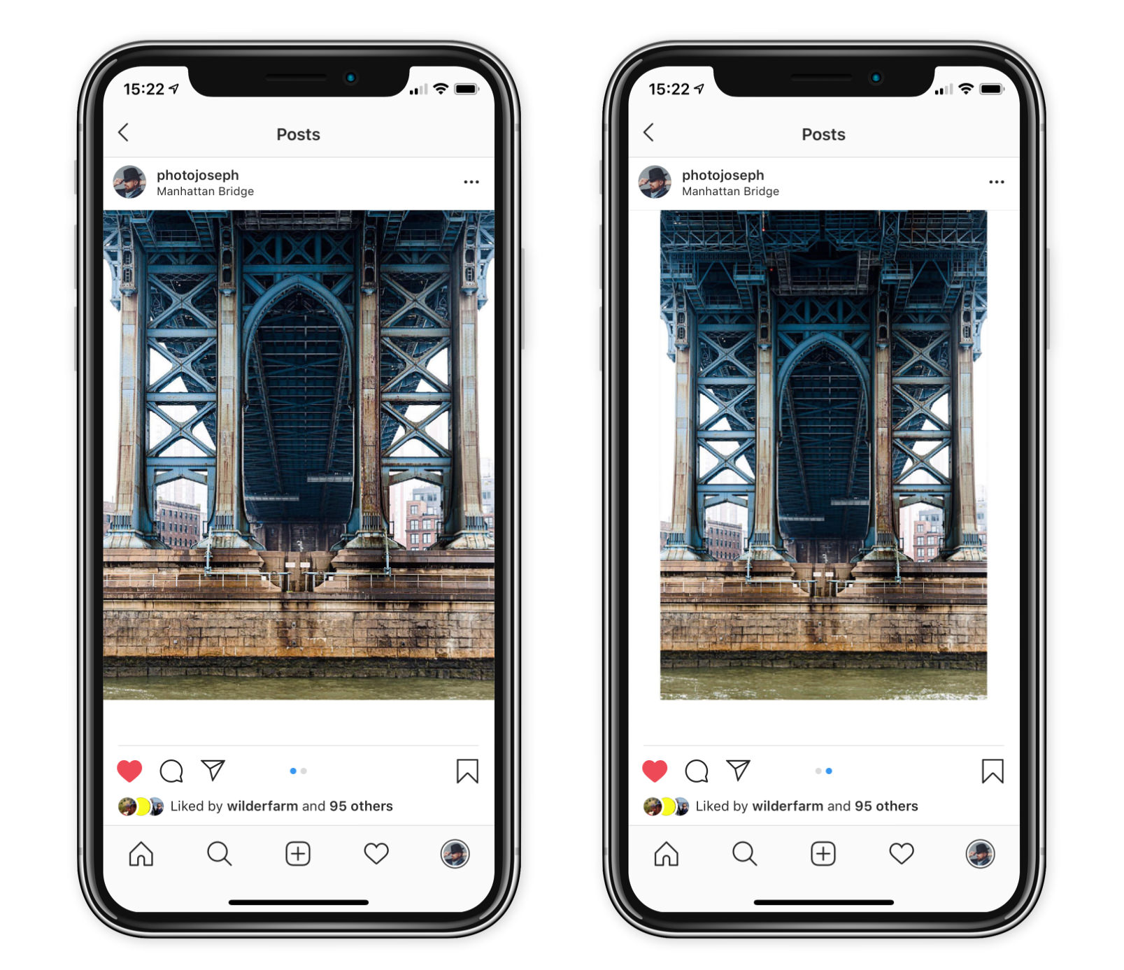
04:00 making this really easy to do and I want to align it, let's say right about like so. OK, there's my normal crop, my Fullscreen crop. Up in the top right I tap the share button and then save that to the Camera Roll. Now I'm going to do the same picture a second time, but showing the entire thing. So I'll pinch this back down so that it fills top to bottom, and center that and that is going to create the white borders. Now it shows up as transparency and we actually will get transparency in Instagram up until it actually posts; that's just the way that it works. Tap the share button again' Camera Roll. And there we go. Okay, so now we have those two images ready to, ready to post. Let's go over to Instagram. The first image is actually the second one here 'cause they're in reverse,
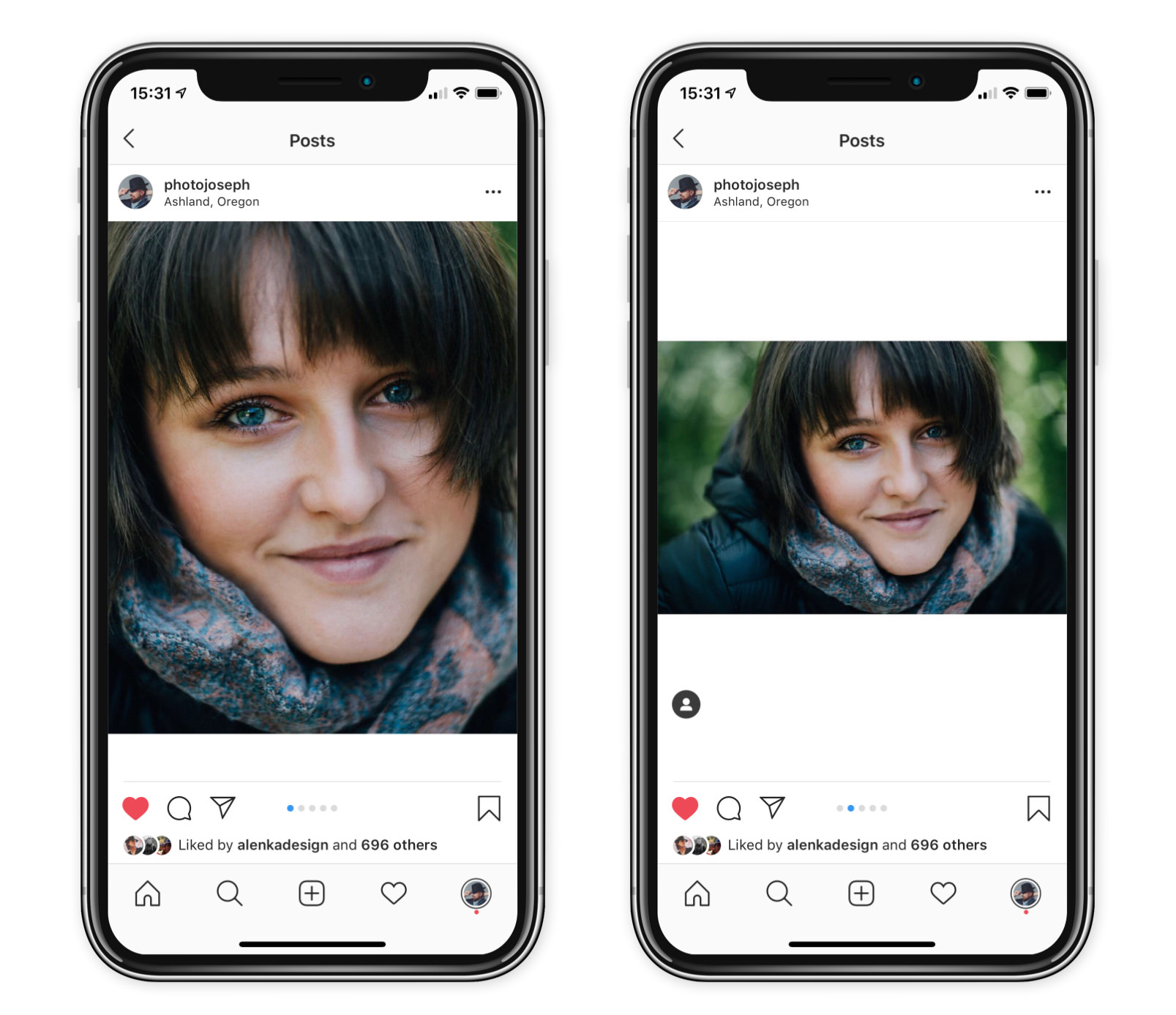
04:37 so I select that first image. You gotta make sure you tap the little Double Headed Arrow so it pinches out so it zooms out. There's the whole thing. So this is the cropped Fullscreen version. Then tap the little multi selector tool. Tap the second one, and now we have the second one loaded up. From here when I hit next, at this point you're kind of seeing it but not with the full borders, so we need to tap next again and then tap on the icon here to really see what it's going to look like. So this is what it will look like when people are scrolling through. They'll see the full screen image like so and then the full image with the white borders like that. And that's it. That's all there is today. And again, you want to have this first one because this is what your thumbnail will be built off of when you're looking at the thumbnail view.
05:16 Neat. Okay, let's do this again for a landscape photo. So let's see the next one here. We're going to use this one. Same thing. I'm going to go tap in here. Open in, I'll do small and it's actually going to turn out that that's a mistake, but you'll see that in a moment. Copy that to Photoshop Mix. You don't have to worry about closing out the old file. It just automatically opens up a new one. And once again change the size and I go to change the canvas size, tap on custom and I see that my width is plenty, but my height is not enough. I don't have 1350 pixels high because the 2048 width, the way I had cropped, it already didn't work out. Oops. So if that happens, just go back into Lightroom and do another open in, and this time I'll use the maximum available.
05:56 So now I'm going to have a bit more data to work with. Normally I wouldn't need it, but here of course I did. Okay, so back into Photoshop Mix, hit the crop button, resize that. So this is going to be once again, 1080 wide and 1350 tall. Okay, so that's zoomed way in there, but that's fine. Let's go ahead and pinch this down and for the first image that I want, even though this was a landscape photo, I still want that vertical cropped image for the first opening shot. So I'm going to resize this. Now, if — a little tip for working in Photoshop Mix here — if you're having a hard time scaling it, it might be easier to move it over to the edge like this. Grab the corner and then pull it out and you'll see it does very nicely snap to those edges there.
06:36 And now I can easily pan this over and get the shot. So let's say right about there, that looks pretty good. All right, save that to the camera roll and then we're going to do the exact same thing as I did before. Pinch that out. Go to the edge there, go to the edge there, center that like so… save this to the Camera Roll. And at that point too, if you decided you didn't really want to show the full width, you wanted to go on a little bit closer, obviously you could. So now let's go back to Instagram. Create another new photo. There's that first one. Again, tap the Double Headed Arrow to pinch out. Tap the multi-select, tap the second one and there it is. So next, next tap on the preview. And this is the first thing that people will see. And then when they swipe, they'll see that.
07:17 Now, one of the other advantages of doing this other than just the simple fact of showing your whole image is, and this is, this is a bit anecdotal, I think this is what's happening. I can't guarantee it, but it seems to me that if someone is scrolling past your image there and doesn't swipe to see the second photo, that they're going to get shown by Instagram, that same post again starting on the second photo. And I say that because multiple times I've gone through in Instagram just flipping through and I see a picture and I realize that that picture is part of a series and that it's not the first, but it's the second part of a series. So I swipe back to see the first one and realize I actually have already seen that photo. So I guess the first time I saw it I just didn't swipe through because the second one is new to me.
07:58 So I think that's what's happening. So this really is, even though it's just one photo in this case, it is to your advantage, I believe, to get your feed out there, uh, more, right? To get it more likely to be seen by somebody 'cause Instagram might show it multiple times. Kind of neat. Okay, so that's that one. Now let's talk about doing the multi tile panorama because that is really, really cool and there's three different ways to do this and there's what I'm going to call the easy way. There's the hard way and then there's the full on extra way which is really a bit much but you know if you want to do it that way you can; it gives you some advantages. Obviously. We're going to start with this picture of this lovely lady here. This is Theresa, a model. I'm going to go ahead and open this up.
08:36 I am going to use maximum available 'cause I know I'm going to want the bigger resolution and back to Mix and I'm going to once again create that canvas at the default size. However, I'm going to be doing a two tile wide image so that means my canvas to start has to be double width. So I go to the crop, and custom. Instead of making it 1080 wide, it's going to be 2160 (so, double 1080) and the same height, 1350 tall. Okay. Now I resize this image how I want it to be across a two tile swipe. Now because this image doesn't fit into this, what would it be… an 8:5 ratio, I'm going to have to choose a crop position in here so I can, I can put it at the top, put it at the bottom, BUT you have to snap it into a corner.
09:25 We will see what to do if you're not putting it into the corner, if you're not snapping it into the corner; that's the extra way of doing this. That's level three of this. But for now, just trust me, lock it into a corner. The image on the canvas has been pinched to size, to the perfect size here. It is very important at this point that you do not pinch to scale the size again. You have an undo button if you do it accidentally, but you can't change that or things aren't gonna line up. Okay, so that said, this is a canvas that's double wide. Now I'm going to change the size of this to the proper at 1080 wide. Hit OK. Now I'm going to drag the image over and line up the left half. And this is where I was saying that it's really important that you use a corner so that it can snap to the corners.
10:06 So we're snapping that. I'm not resizing it, I'm just moving it. I'm snapping to that corner. Let's export that out. Camera Roll. And we've just saved out the left side of the image. Now go over and do the same thing on the right hand side there. Save that out. Camera Roll, save that and we're good. So now let's head over to Instagram. We have to start again with the left hand side. Don't forget to zoom out, do that… load the multi selector, there's the second one, tap next. And at this point we see a gap in there. That's just this preview. So once again, we have to go through to the final preview and now you can see there's no gap, there's no visible lines. So anybody looking at this is going to see this double wide image right there. Cool, right? Okay. Now let's go to another level of this.
10:44 Now we're going to go to level two. Okay. For Level two, I'm going to use this picture here. In this one I'm going to NOT have the corner snapping exactly the way I explained it and the previous one. This is the one where I'm going to have to do a little bit of extra work. Open this in Photoshop Mix and once again I'm going to set the canvas to that double-wide size. We're going to do a double wide on here, so custom and that was 2160 by 1350. You do this enough times, you'll remember the numbers; don't worry. Tap OK on there and in this case — so if I was going to do a full normal like I did previously, I would set it like this, but that's not how I want to crop this one. I want to crop it in like so. Now you already saw how on the previous one I talked about how you had to snap into the corners.
11:25 If I at this point change the canvas size to 1080, there's no way that I'm going to align this image exactly right on left and right. It's just not gonna happen. So what I have to do is get rid of all the extra data, all the surrounding data in there. So to do that, I will export this out to the camera roll as it is. It is going to save this out as the full resolution on there. It's actually a PNG, what it's creating. So we're not losing any quality, however it has gotten rid of the cropped edges. So now I can go back the default screen here in Photoshop Mix. Go Plus to create a New Project… Image… On My Phone and in All Photos there's the first image. Now I can crop this, this one, I can crop to that 1080, 1350 is already set,
12:10 move this over to the right. (I'm gonna get out of the crop window there.) Move this over to the right, like so, export this to the camera roll and move this over and export that to the camera roll. At this point too, don't forget, you could just create a third image that is the full width, right, so I can go ahead and here export a full width photo like this as well. I may as well. We're going to start with that one on the left, zoom out, select the multi image two, image three, hit next. Again, we don't see it lining up there yet. Go to next to see it here and there it is. There's that second, that first and second image and then the third image shows the full thing, so you can do that as well. All right, now we're going to level three.
12:50 Level three is basically the same thing we just did except that we're going to do a three tile wide image, so back to Lightroom. My next image here, you can see it's quite a bit wider, so this time we're going to re-crop this 3240 by 1350 okay, and let's see here. How do I want to crop this image in there? Great, that's good. Once again, I have to share out that full image so that it creates that crop. Then I will open up that crop. And here you're about to see the trick for creating the three-up. Okay, so remember our canvas is triple wide. If I go in here and I change this canvas size to 1080, which is what I'm going to do and I move this image at this point… probably never going to get it back. I mean, okay, it'll snap to the center, but let's just, let's not mess with things.
13:37 When I changed the canvas size, it zoomed in perfectly into the center. So this what we're looking at right now is your perfect center crop. Export this to the camera roll. Now I can look over at the left side, position that to the camera roll and do the right side and export that to the camera roll as well. We're going to start, let's see, that's the left. The middle one was the left one. I wanna make sure we zoom out, select that number two, and then number three and we can preview the whole thing. And there you go. And so now you have your full width image. That's how you can go about creating these images for your Instagram account where you're seeing the full width or the full height of the image without having to crop it in, but still simultaneously getting that thumbnail by loading that cropped image in first, you will get that thumbnail and how you can create the two and three tile wide pans, which is frankly, it's kind of a lot of fun. Hey, if you aren't already following me on Instagram, please do that at @PhotoJoseph. If you haven't subscribed yet to this channel, of course, do that. Hit that like button, and for those of you watching the live show, we're going to jump into the Q&A, right about now!
Comments from YouTube